Baud
Urban architecture, Belgium
2026
Concept proposal
Overview
Baud Architectes is an architectural studio working across architecture, urbanism, expertise, and design consulting.
Solutions
- Visual identity
- Art direction
- Logo system
- Brand applications
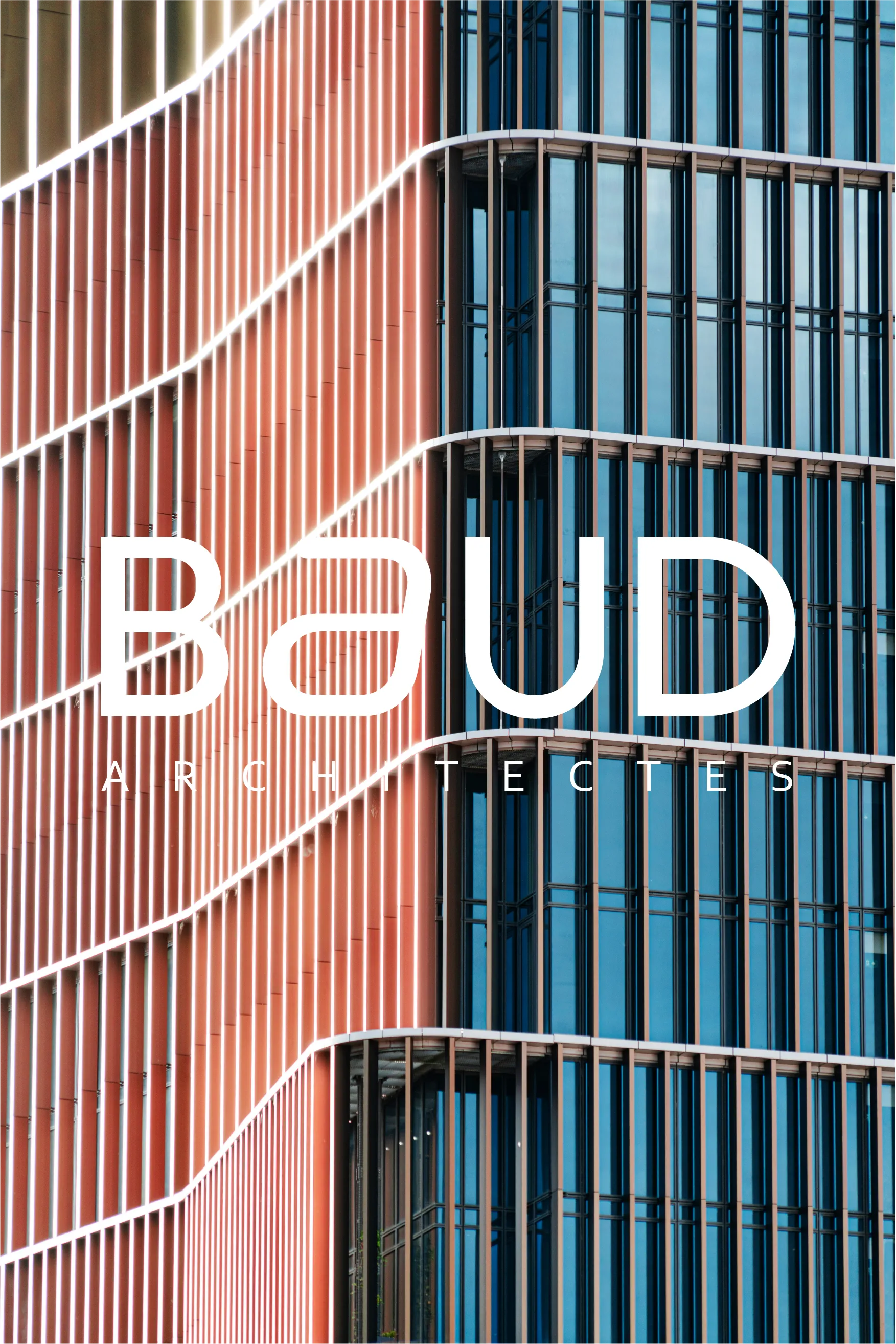
Concept
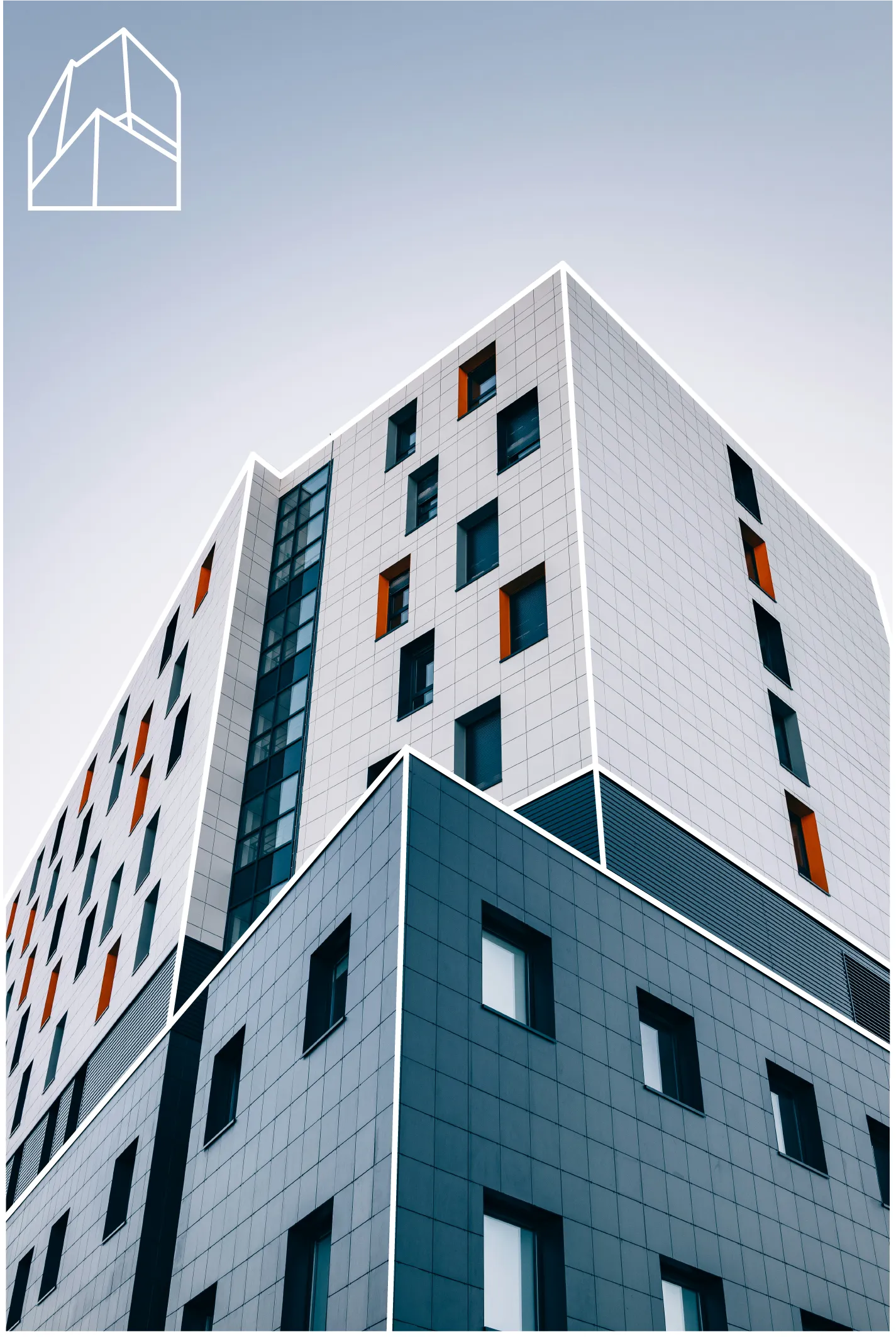
The identity is built around the idea that every architectural project has its own distinctive silhouette.
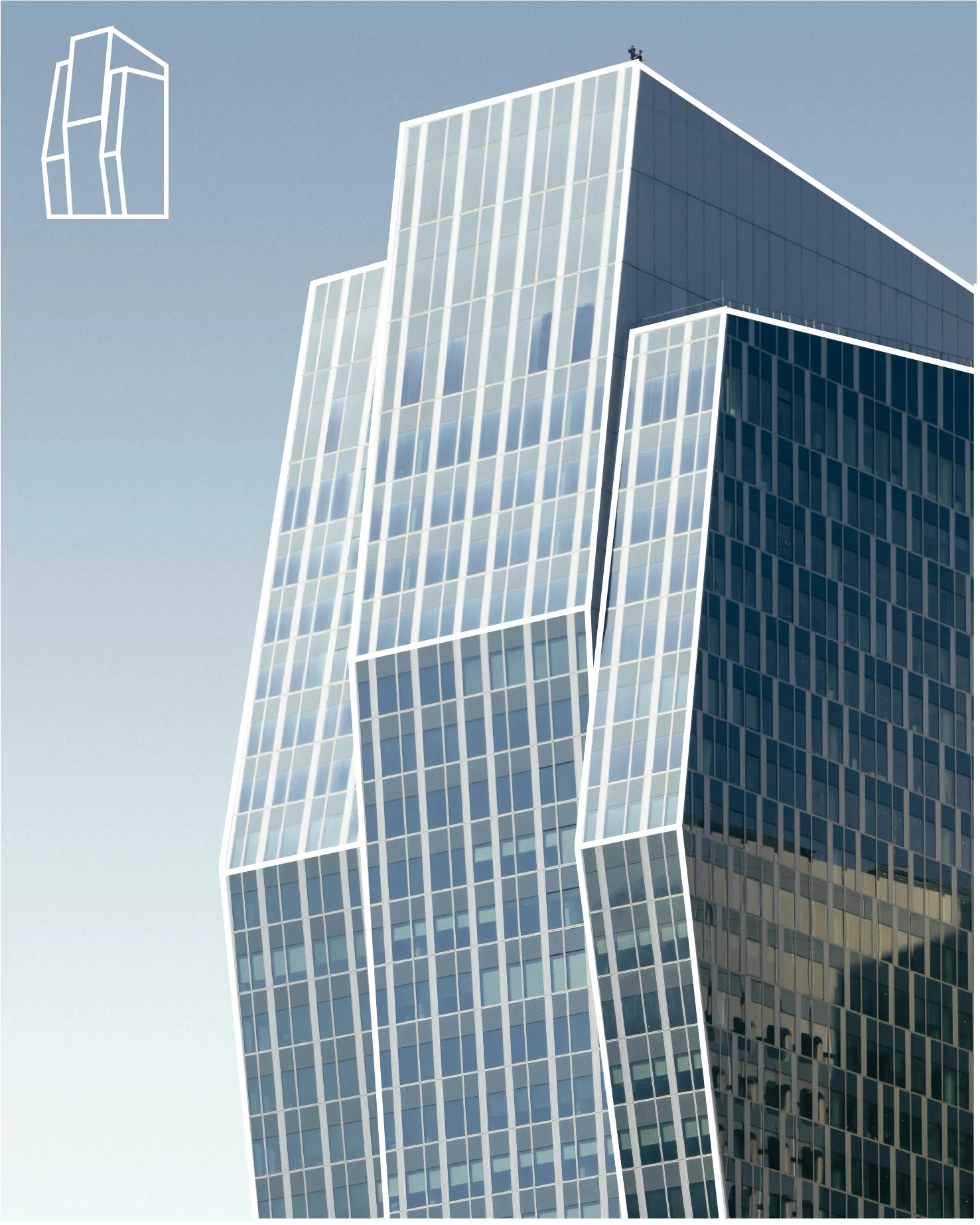
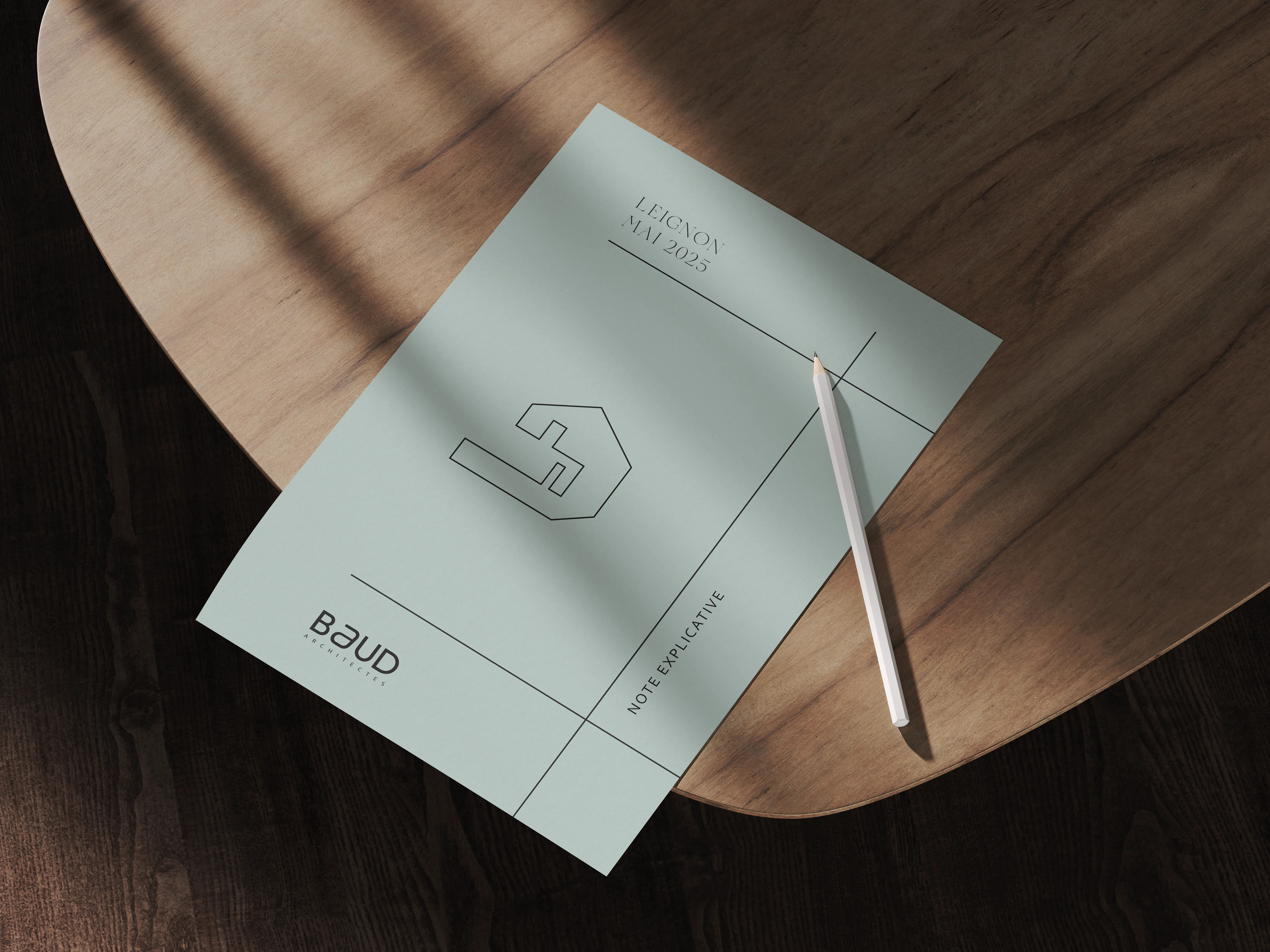
Instead of creating a single static logo, the branding introduces a system where each project receives a unique graphic profile derived from the geometry of the building.
These simplified line drawings translate architectural volumes into abstract graphic elements. Each profile becomes a visual signature for the project while remaining part of the same visual language.
This approach allows the identity to evolve organically alongside the studio’s portfolio.
The Logo
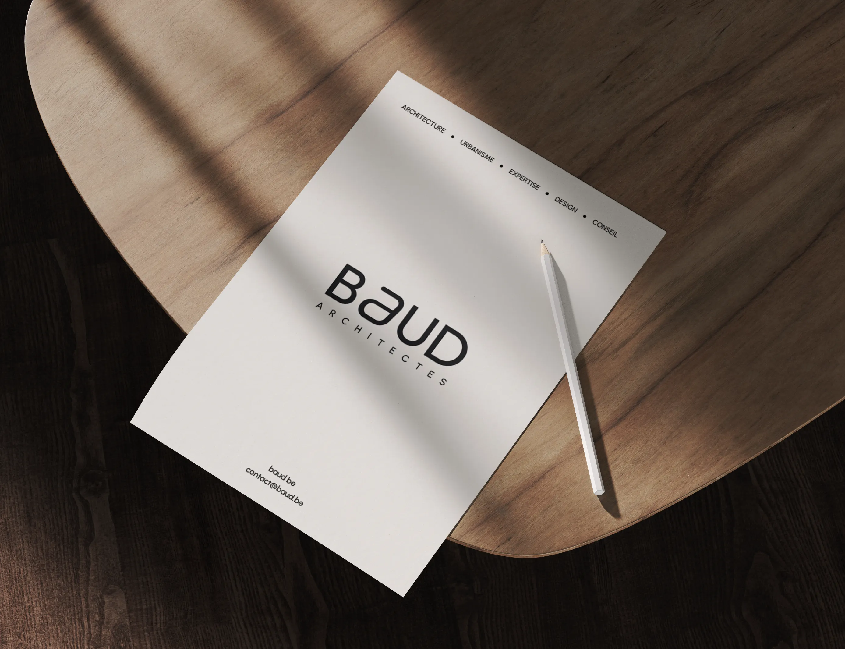
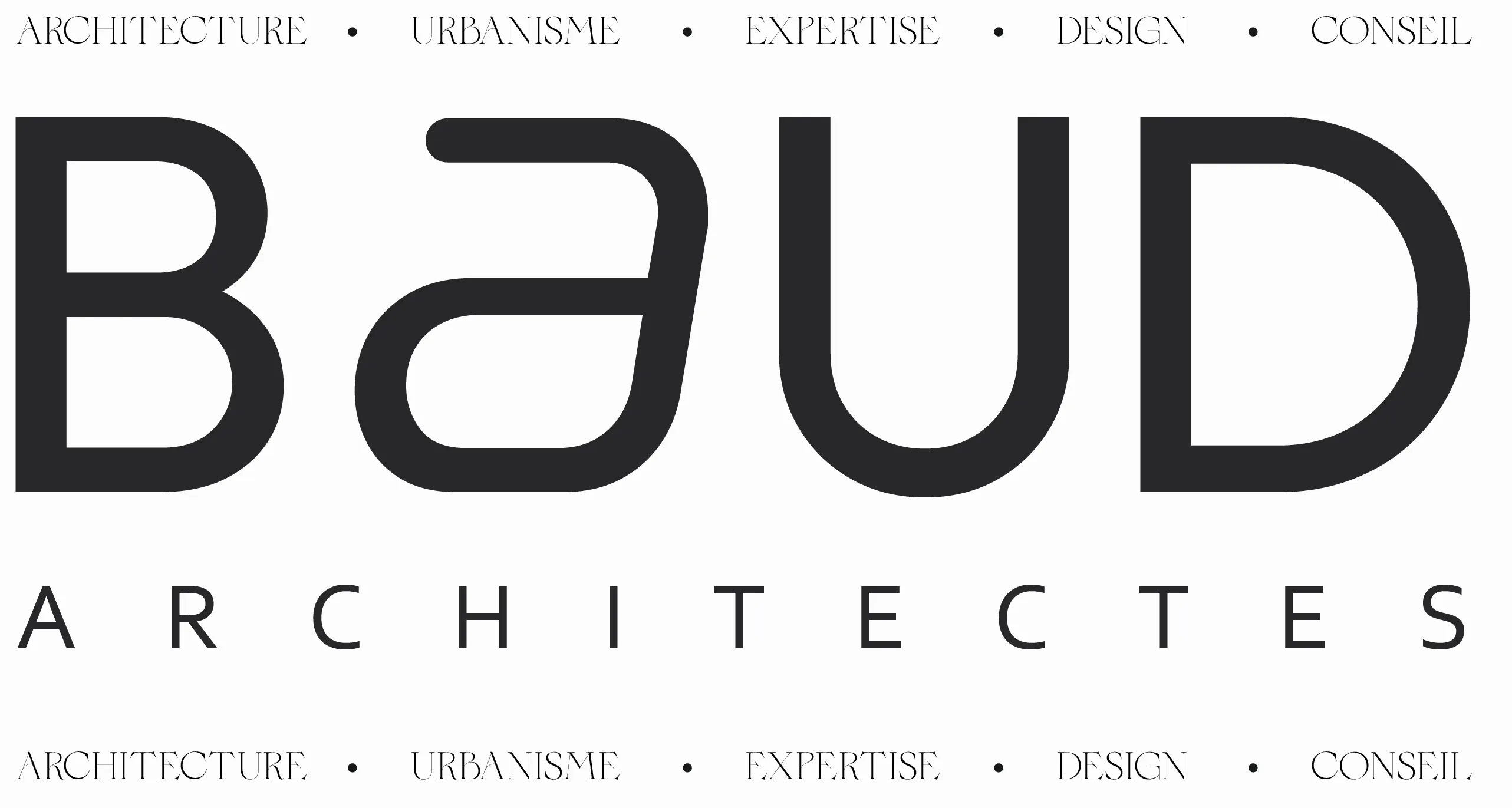
The BAUD logotype uses a contemporary geometric typeface that emphasizes clarity and balance.
Its clean curves and generous spacing convey precision and professionalism — values central to architectural practice.
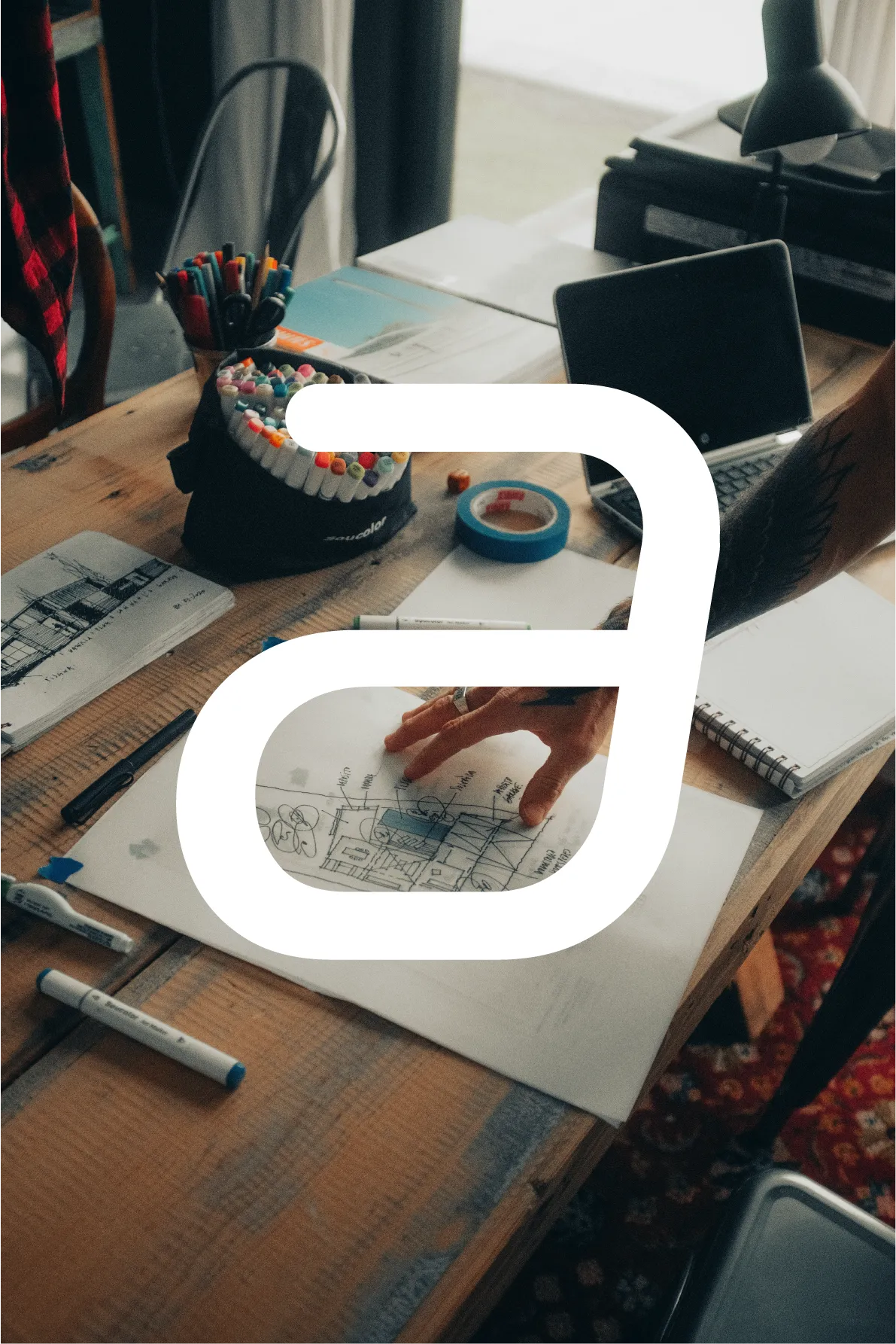
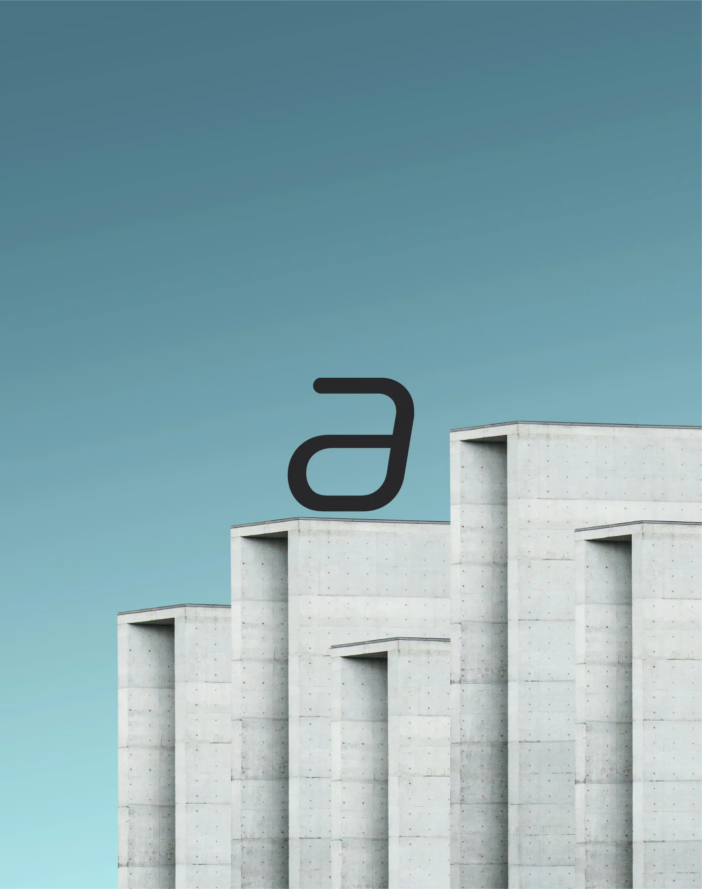
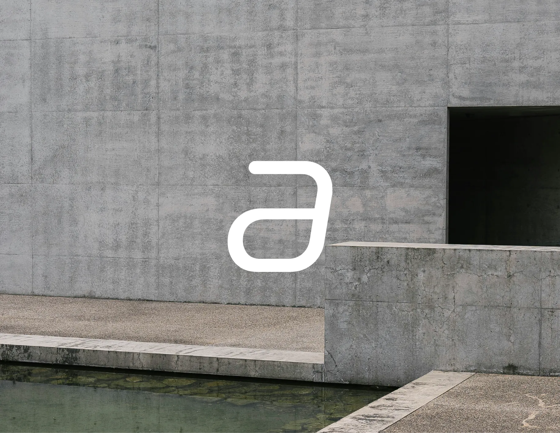
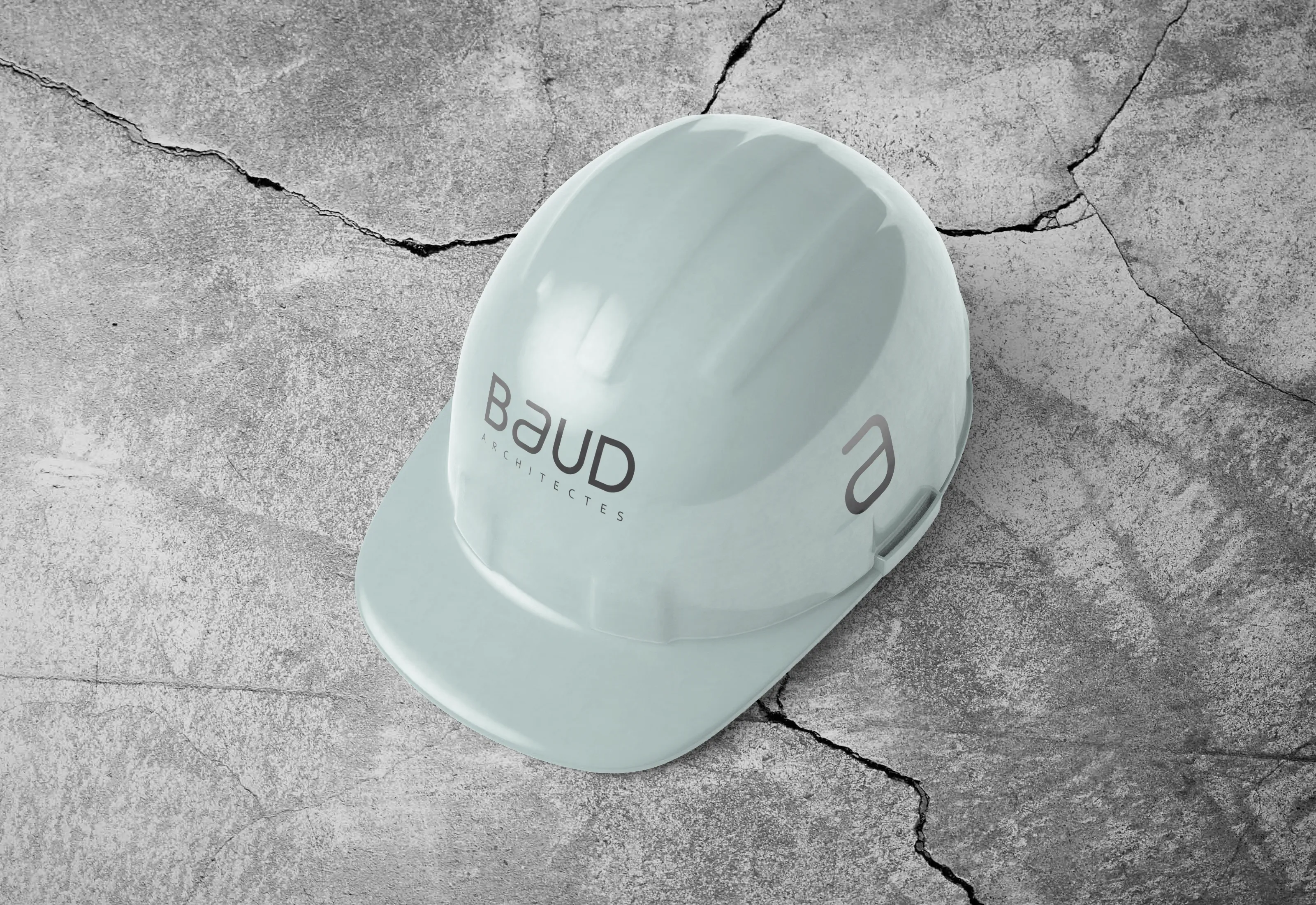
At the heart of the identity lies a stylized “a”, extracted from the logotype itself. This symbol becomes the distinctive element of the brand.
Its continuous rounded form evokes architectural lines and structural fluidity while maintaining a strong visual simplicity.
The Project Marker
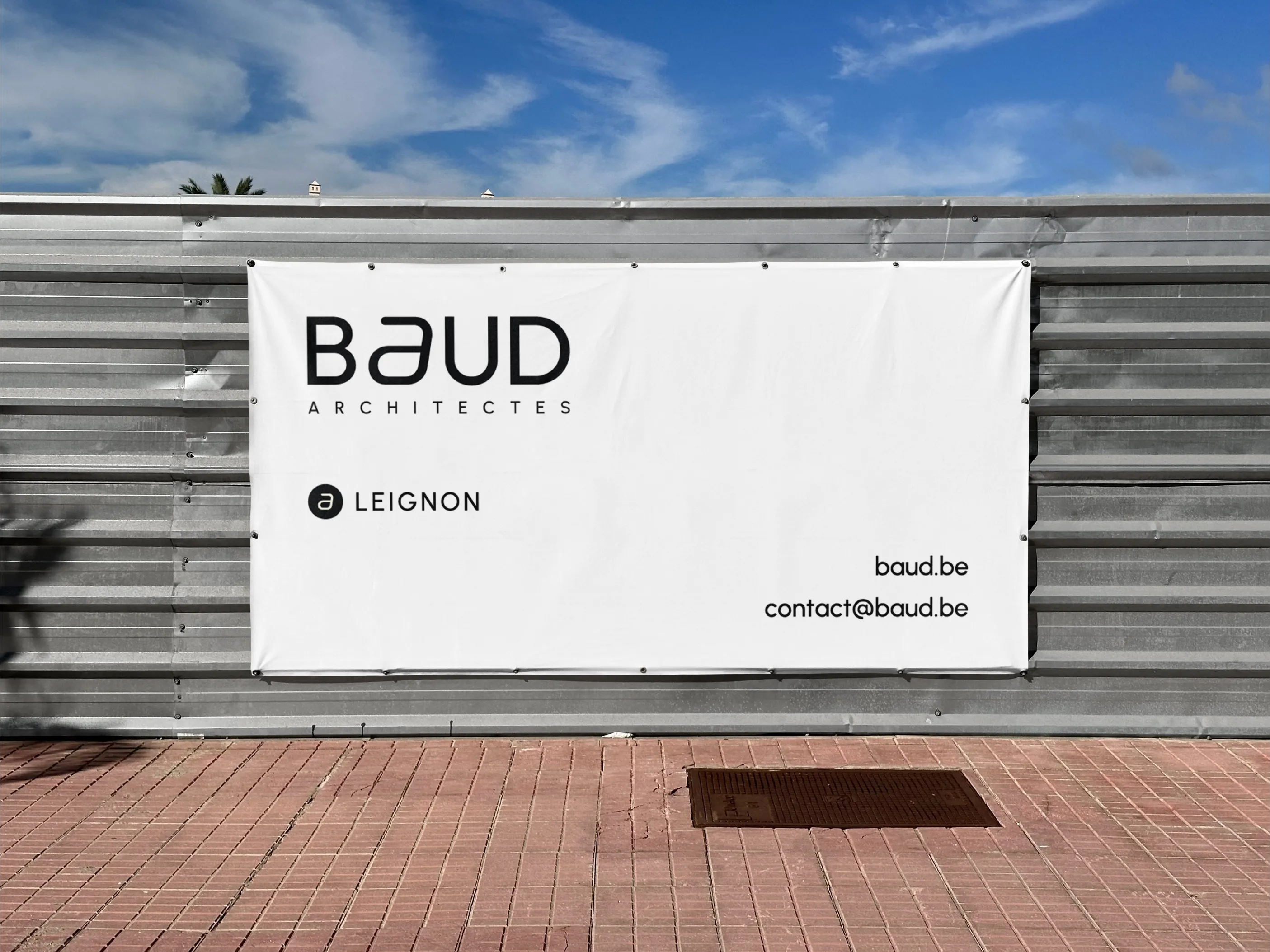
The stylized “a” also functions as a project marker within the identity system.
When paired with a project name, it acts as a visual indicator — similar to the logic of a digital tag or “@”.
This creates a clear connection between the studio and its individual projects while maintaining a consistent brand language.
The symbol becomes both a signature and a navigational element within the studio’s communication.
Graphic Profiles
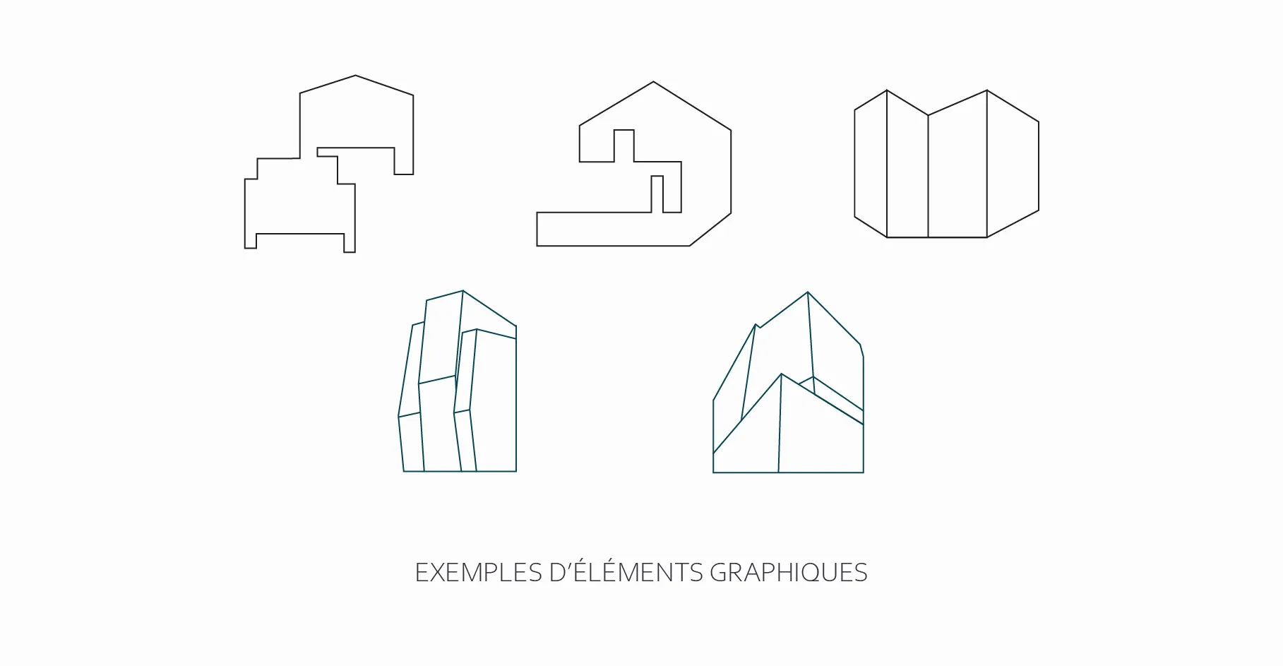
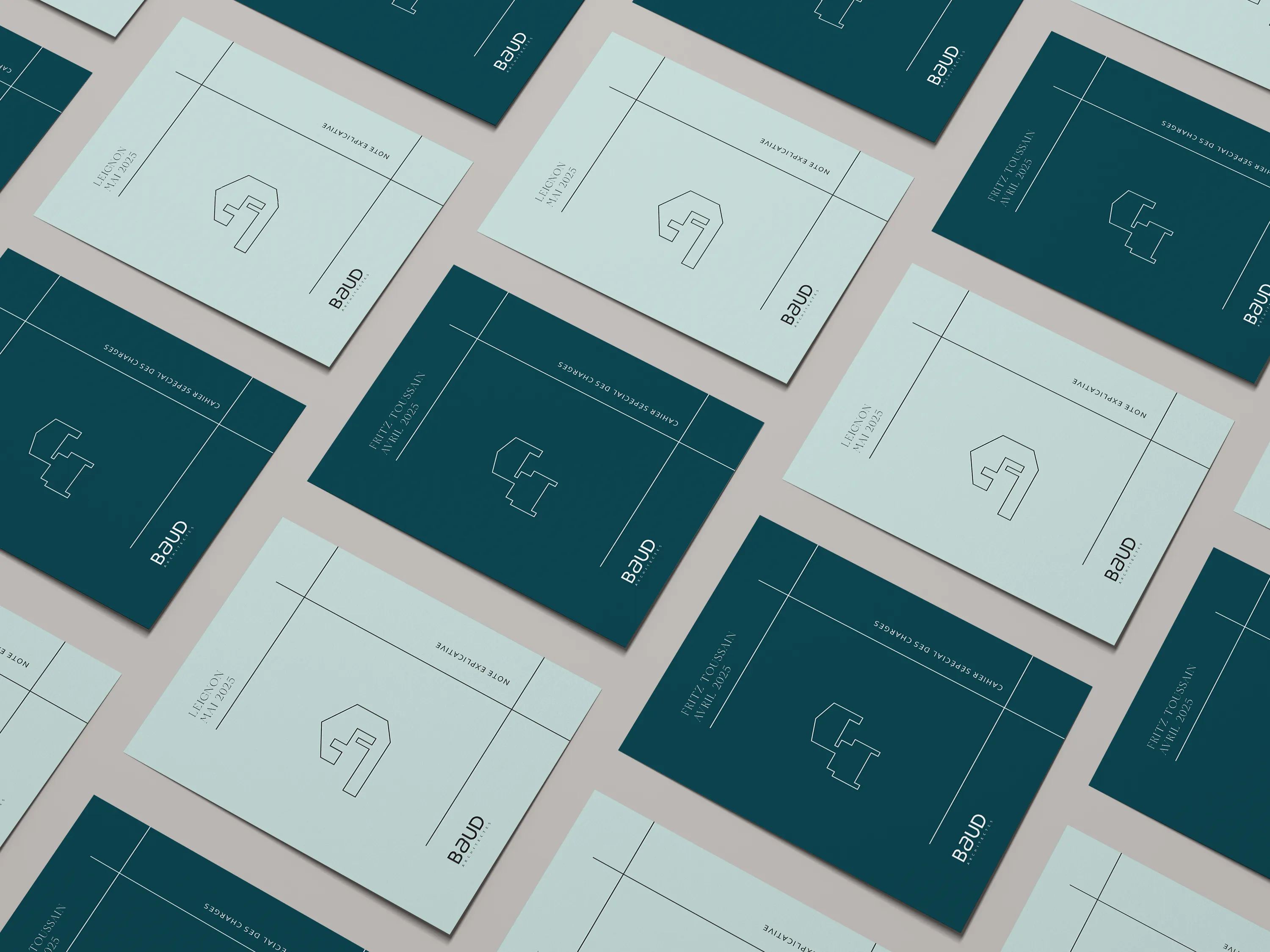
Each architectural project is represented by a unique graphic profile derived from its characteristic forms.
These line-based icons abstract key structural elements of the buildings — façades, angles, volumes, or silhouettes.
Together they create a visual library of architectural identities linked to the studio’s work.
Applications
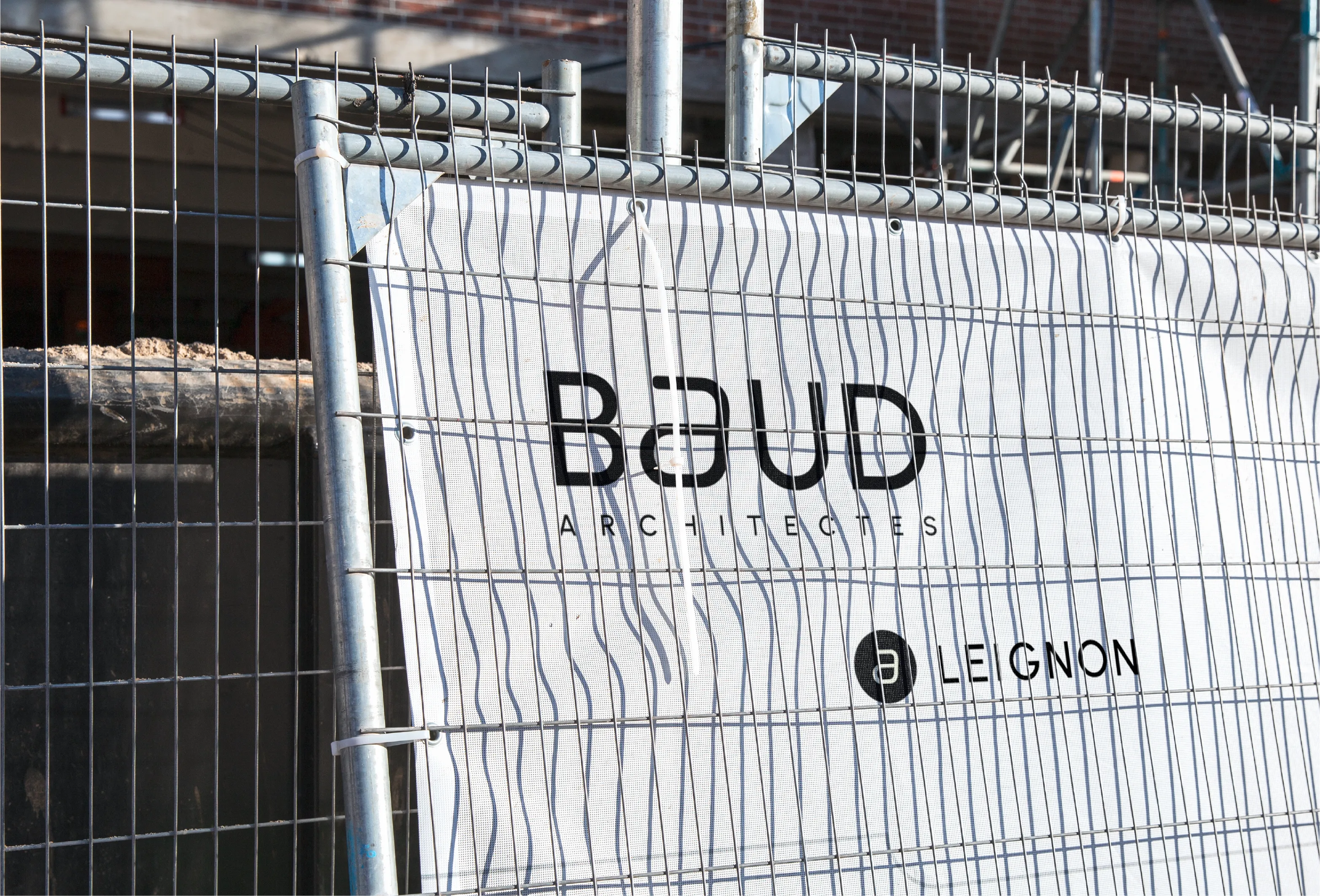
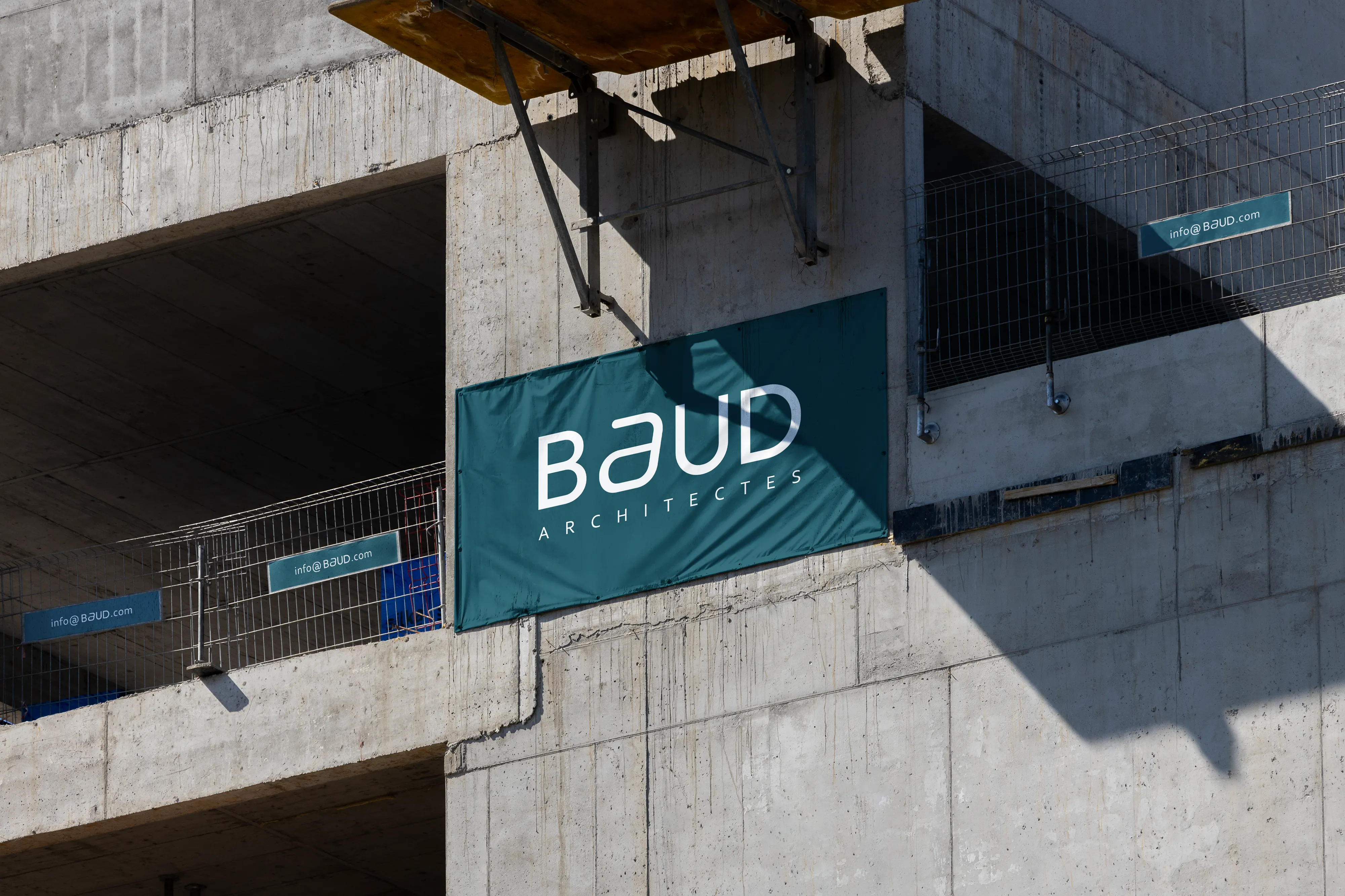
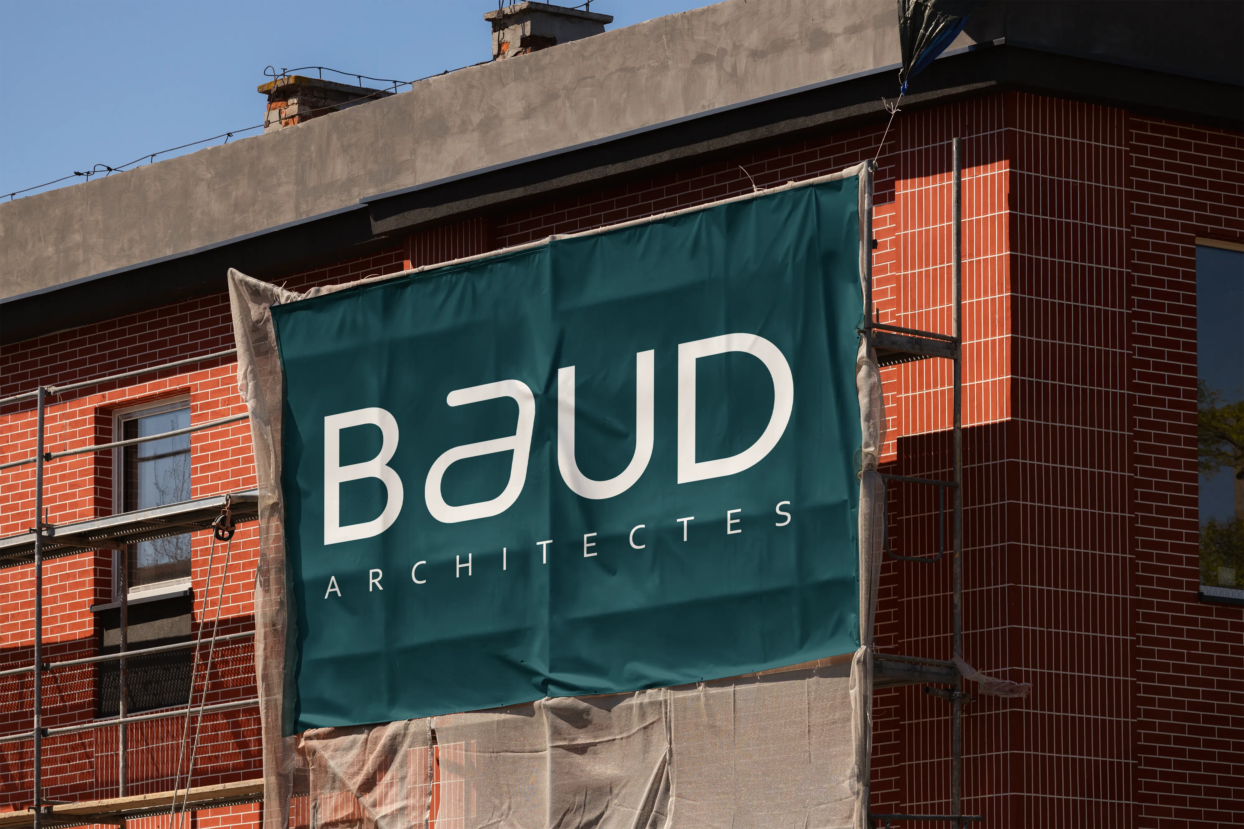
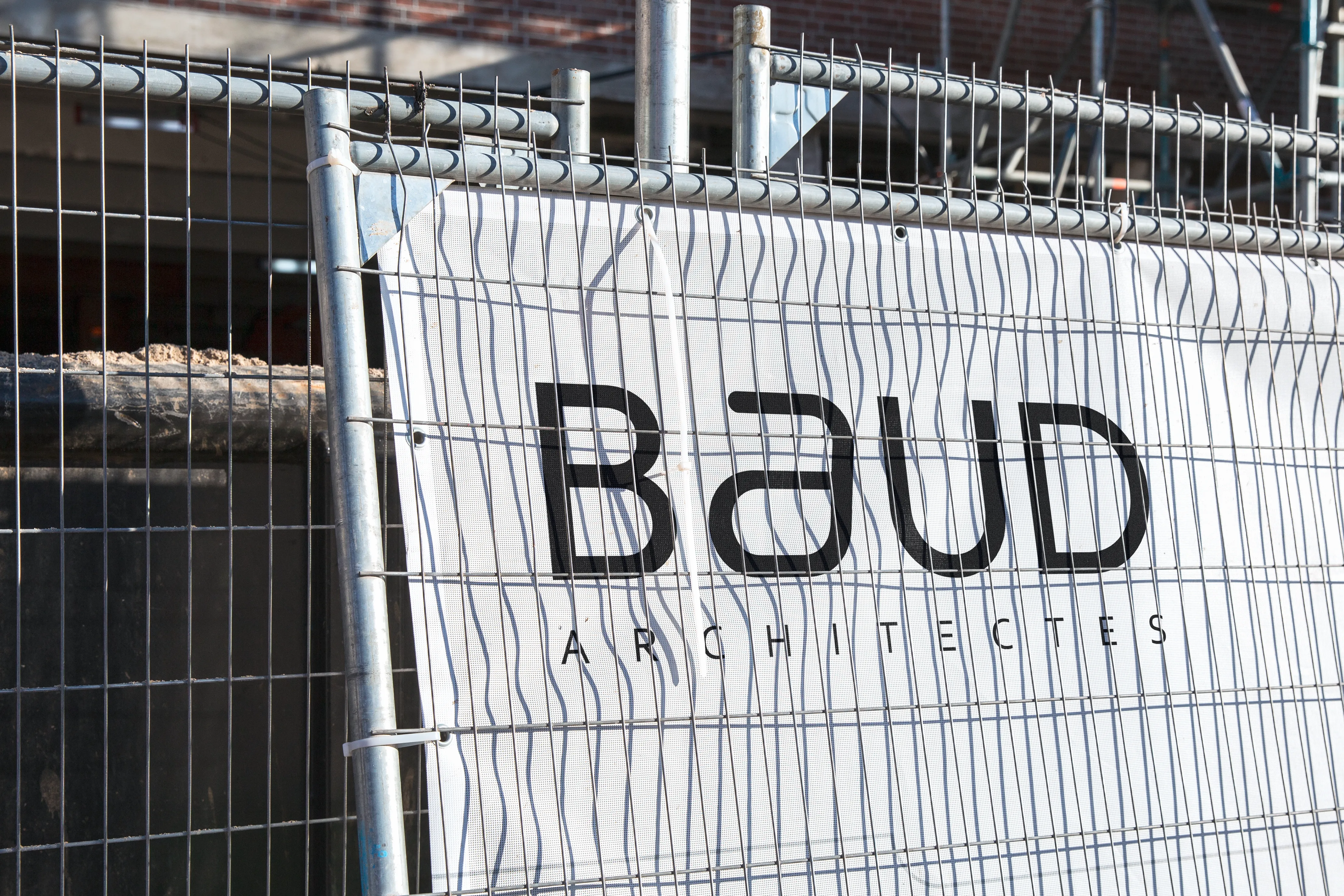
The identity is designed to function across architectural contexts — from construction sites to presentation documents.
Large-scale applications such as construction banners reinforce visibility on site, while printed materials maintain a refined and professional aesthetic.
The minimal graphic language ensures clarity across both technical and visual communication.
Result
The result is a modular visual identity that mirrors the nature of architectural practice: structured, adaptable, and evolving with each project.
Rather than a static logo, the system becomes a living archive of the studio’s architecture.
Palette
[01] #1F1F21
RGB 31, 31, 33
CMYK 6, 6, 0, 87
[02] #F4F4F2
RGB 244, 244, 242
CMYK 0, 0, 1, 4
[03] #C6DCDA
RGB 198, 220, 218
CMYK 10, 0, 1, 14
[04] #0C4651
RGB 12, 70, 81
CMYK 85, 14, 0, 68
[05] #CAF567
RGB 202, 245, 103
CMYK 18, 0, 58, 4
The color palette reflects the balance between architectural rigor and contemporary sensibility.
A deep charcoal forms the foundation of the identity, conveying precision, stability, and professionalism. It is paired with an off-white tone that softens the composition and introduces a sense of clarity and space — much like the neutral materials often found in architectural environments.
Cool teal and muted aqua tones introduce a subtle reference to construction materials, technical drawings, and urban landscapes. These colors bring depth to the identity while maintaining a restrained and professional aesthetic.
A vibrant lime accent is used sparingly to introduce contrast and highlight key elements, adding a modern and dynamic touch to the otherwise minimal palette.
Typography
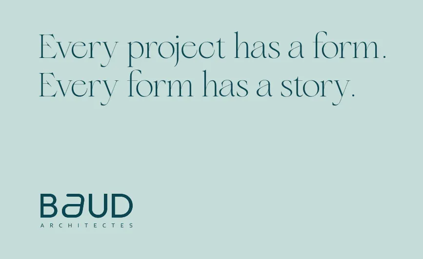
The typographic system combines elegance with functional clarity.
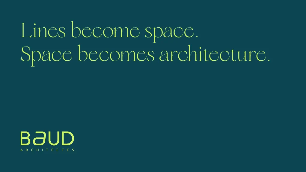
Floreal, used for titles and headings, introduces a refined editorial tone. Its distinctive serif shapes bring sophistication and character to the identity, reinforcing the studio’s positioning within a design-driven architectural context.
For body text, Corbel provides balance through a clean and highly legible sans-serif structure. Its neutral geometry ensures clarity across documents, presentations, and technical communication.
Together, the combination of Floreal and Corbel creates a dialogue between expression and precision — reflecting the balance between creativity and structure inherent to architectural practice.
Context
Baud Architectes is an architectural studio working across architecture, urbanism, expertise, and design consulting.
The objective of this branding exploration was to create a visual identity that reflects the studio’s architectural thinking: structured, precise, and adaptable to a wide variety of projects.
The challenge was to design an identity system capable of evolving with each project while maintaining a strong and recognizable brand signature.
More projects