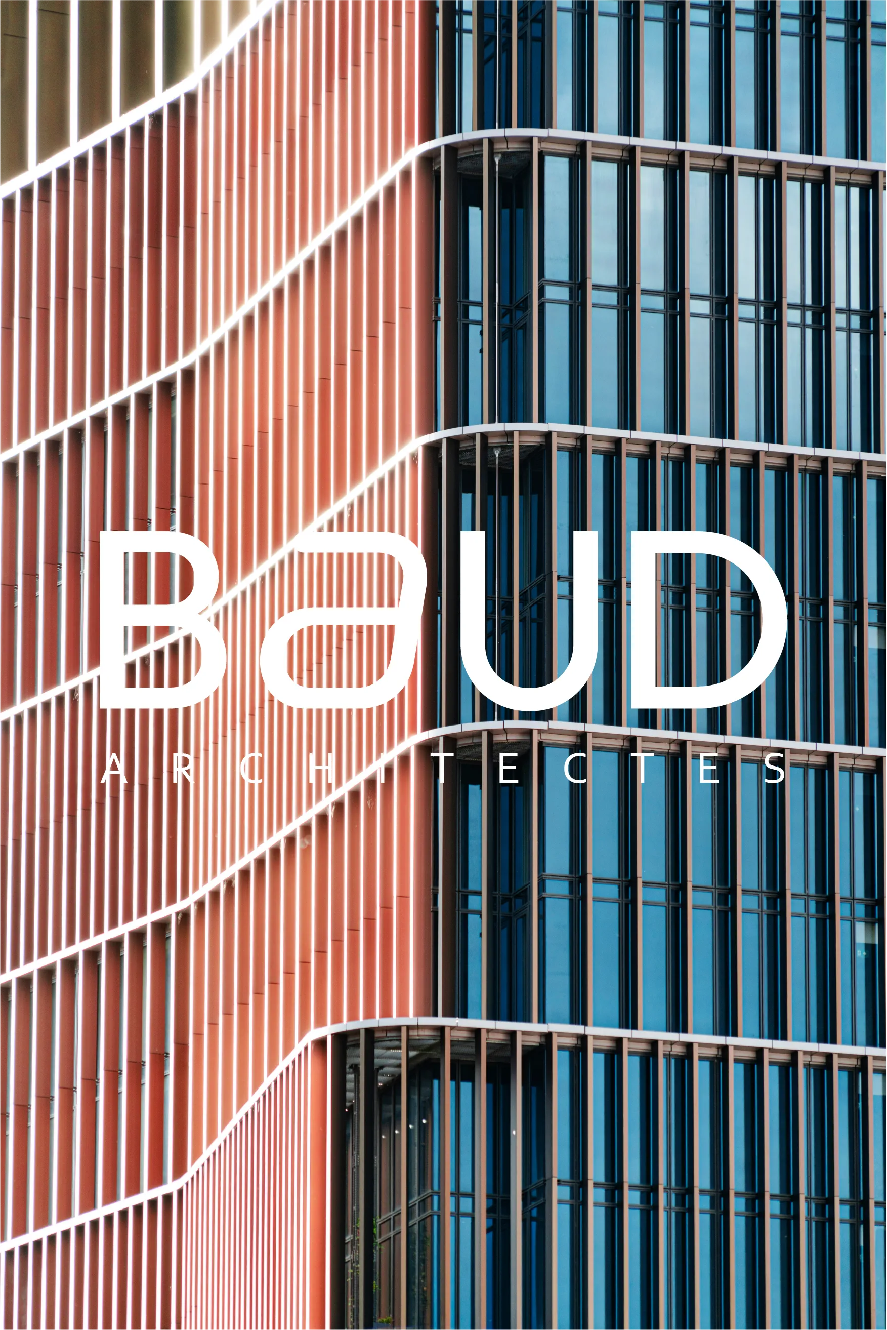
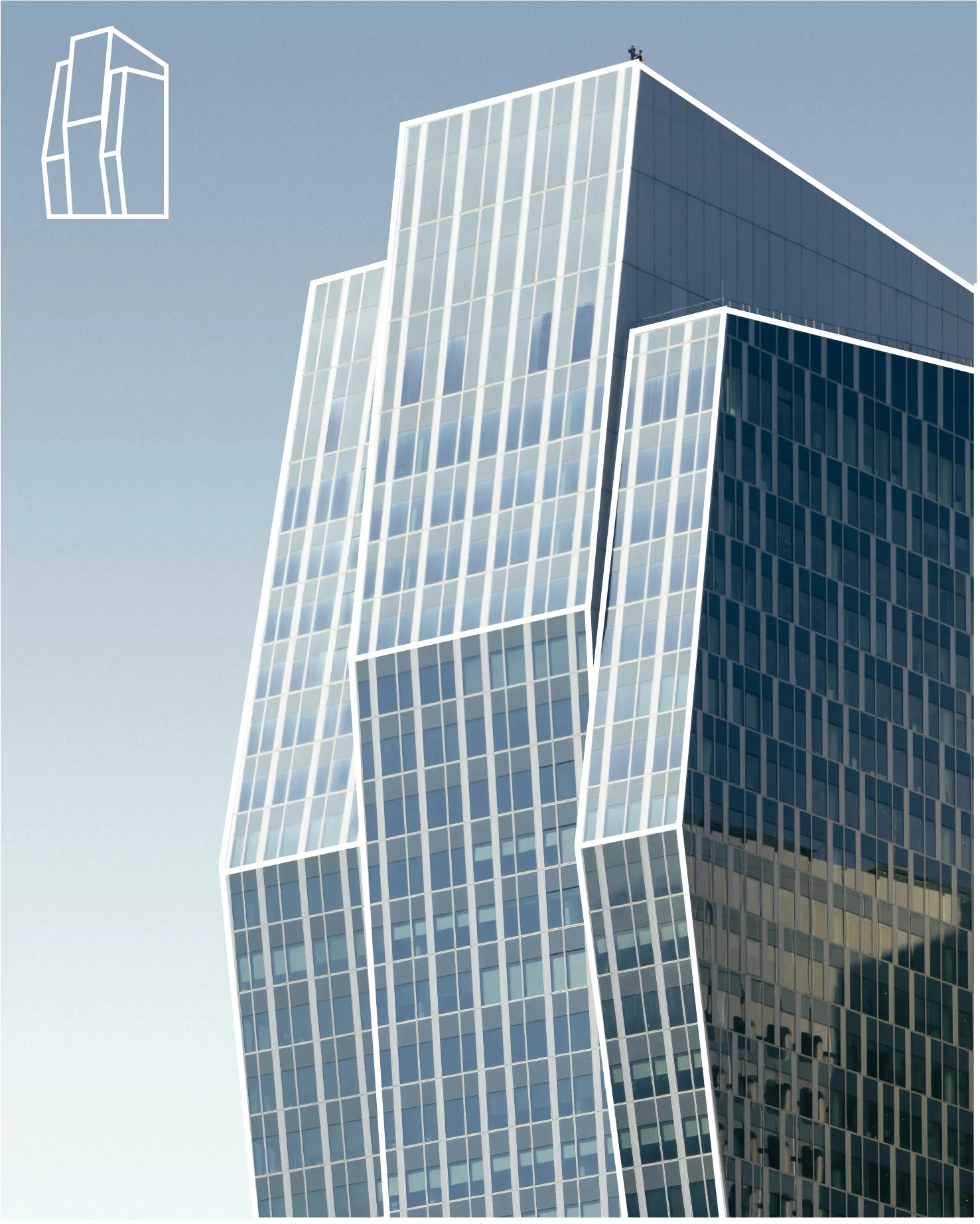
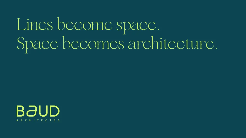
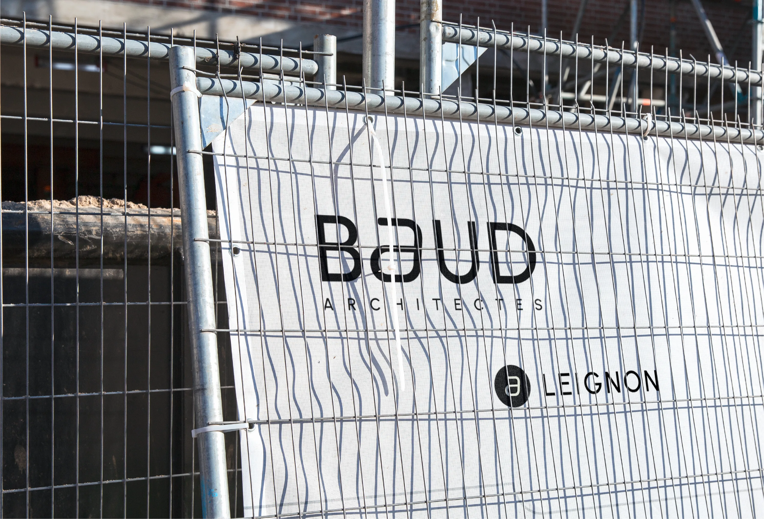
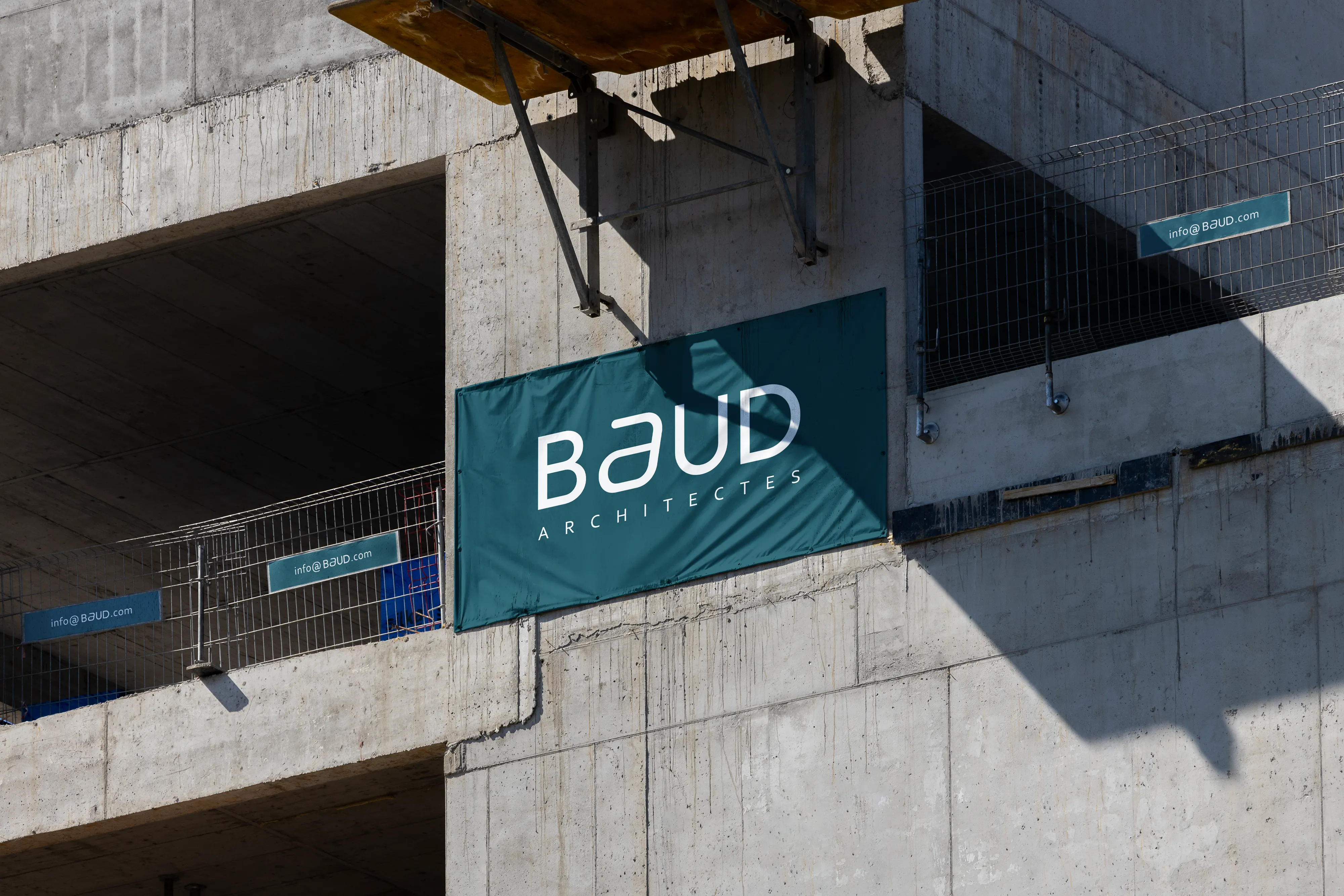
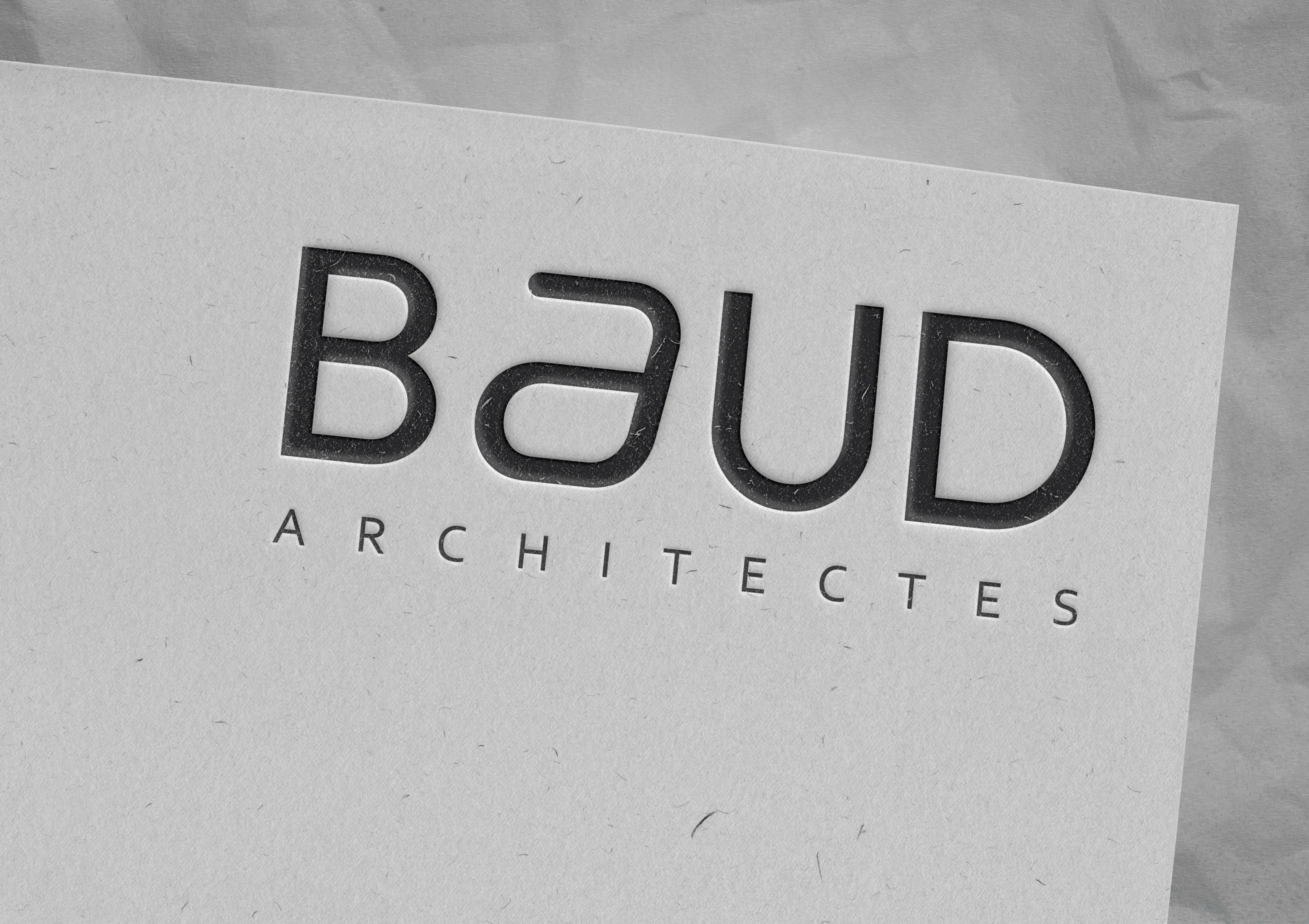
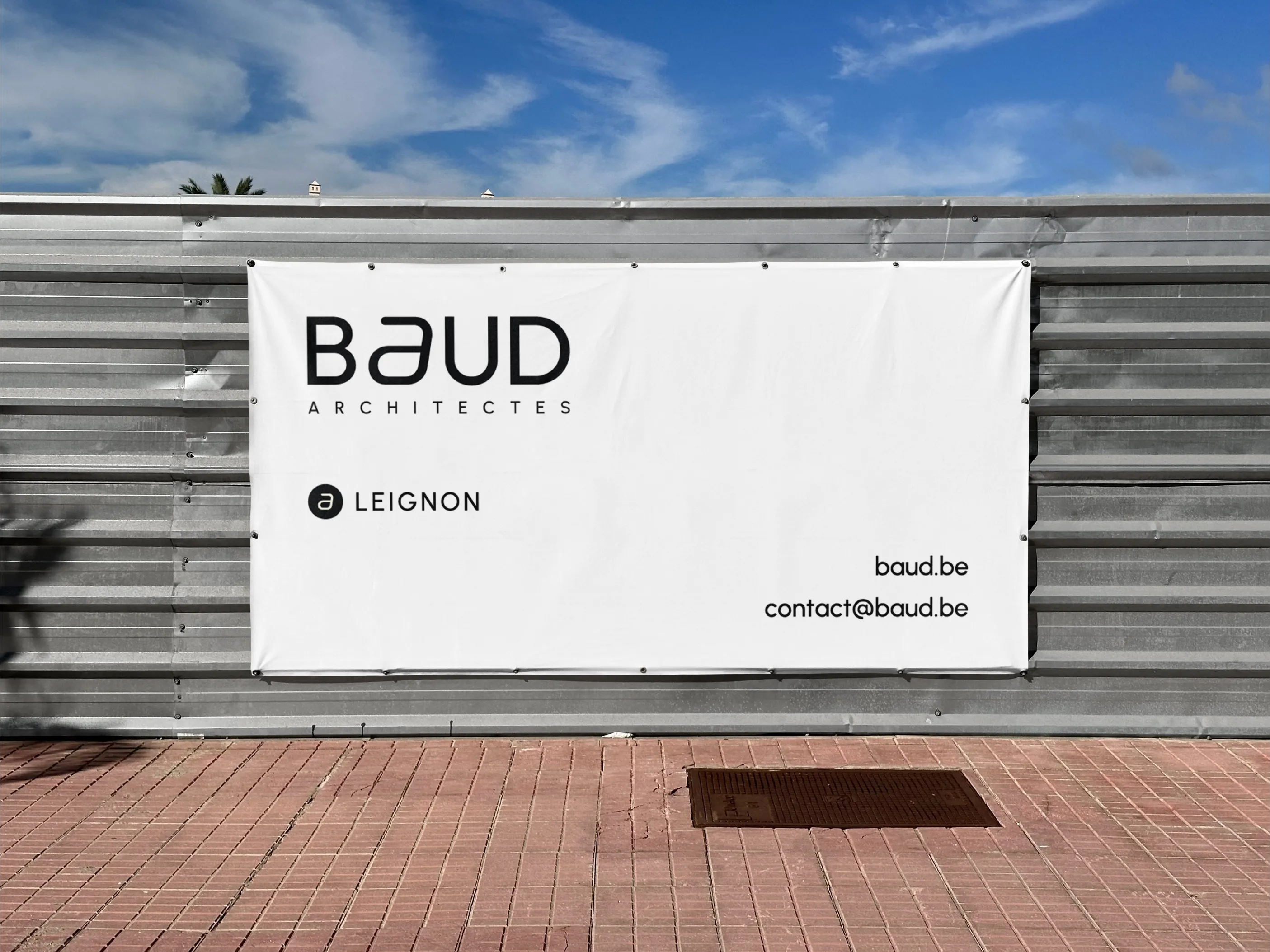
Back to projects

Baud Architectes

Baud Architectes

Designing a modular identity system inspired by architectural profiles.

Responsibilities

  • Visual identity
  • Art direction

About

Identity concept

Client: Baud architects

Sector: Urban architecture

Country: Belgium

Baud Architects — Visual

Context

Baud Architectes is an architectural studio working across architecture, urbanism, expertise, and design consulting.

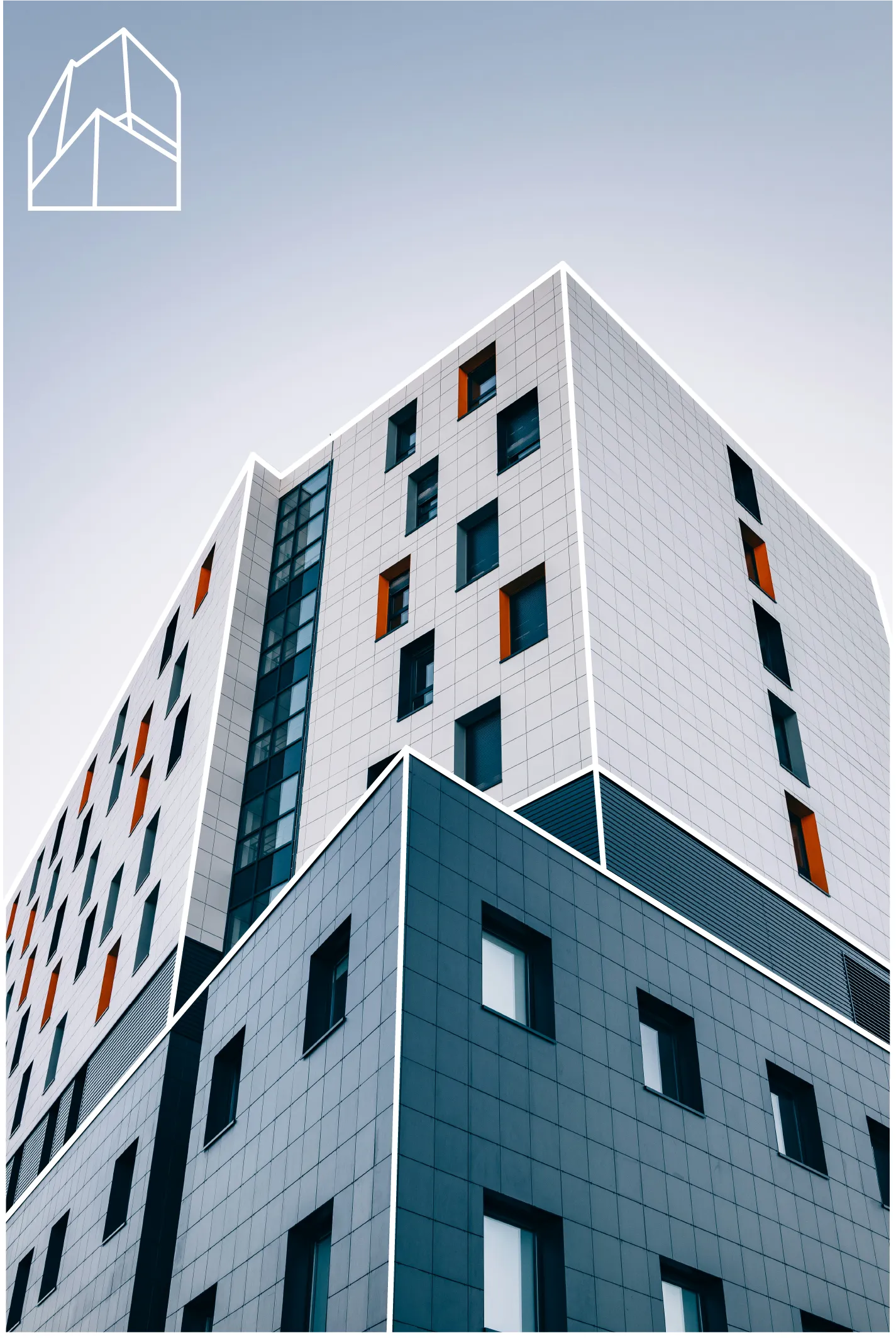
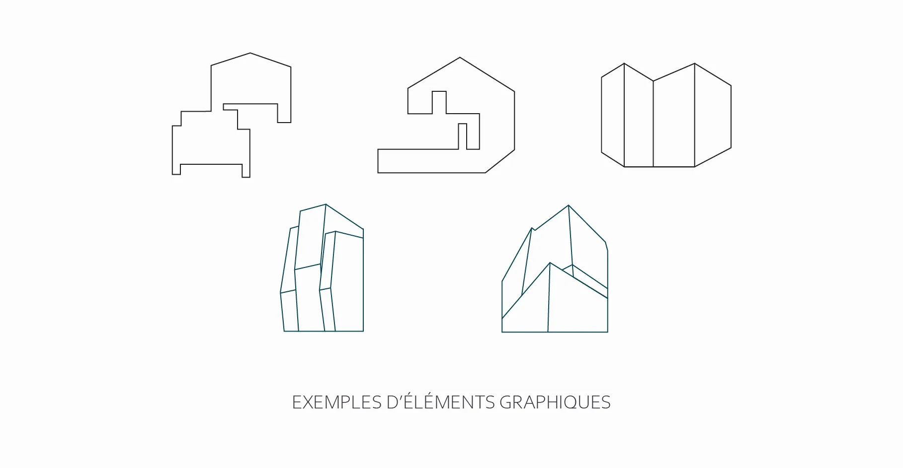
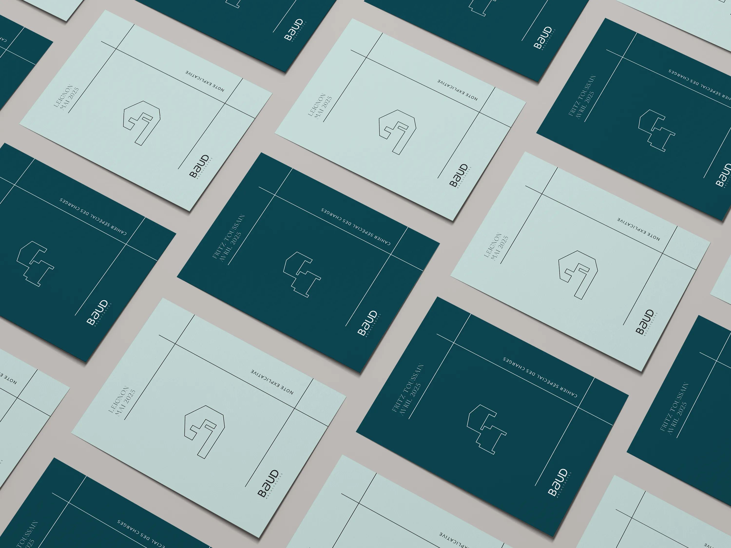
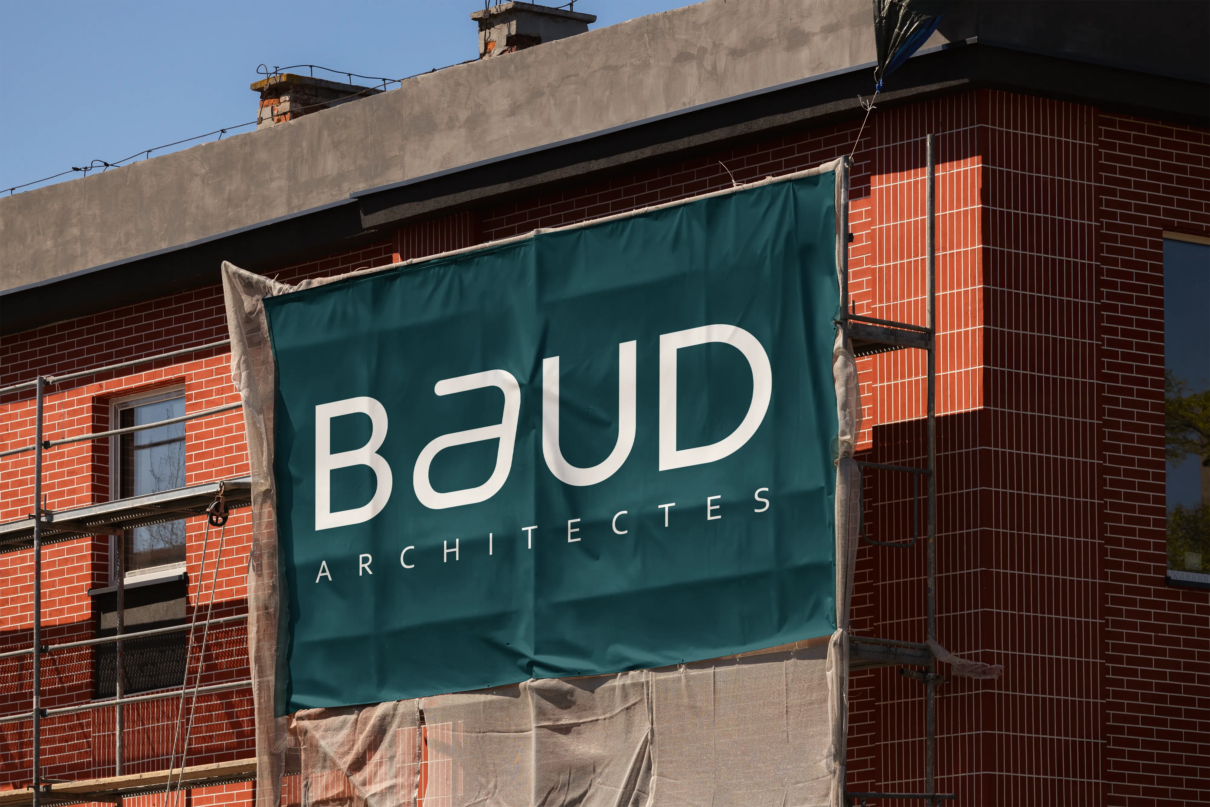
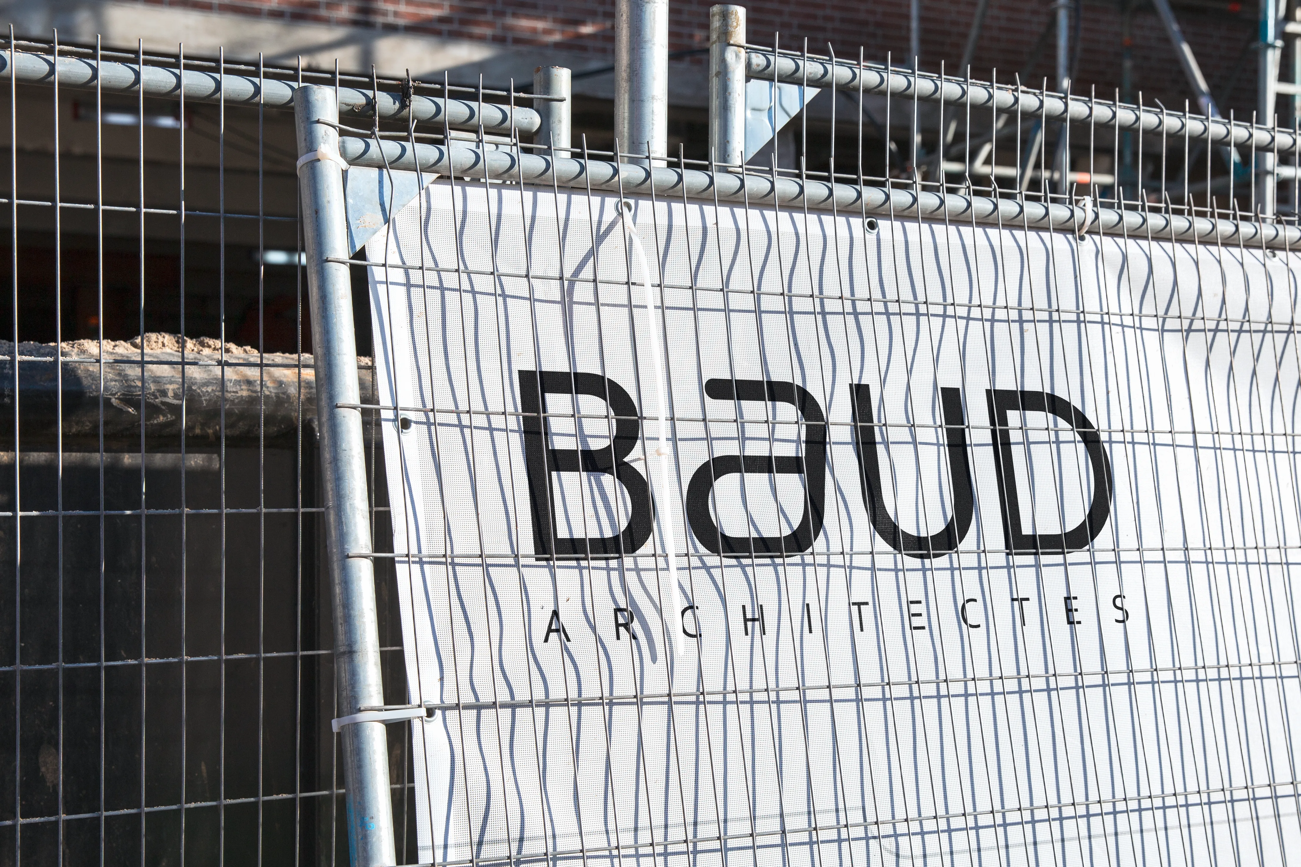
The objective of this branding exploration was to create a visual identity that reflects the studio’s architectural thinking: structured, precise, and adaptable to a wide variety of projects.

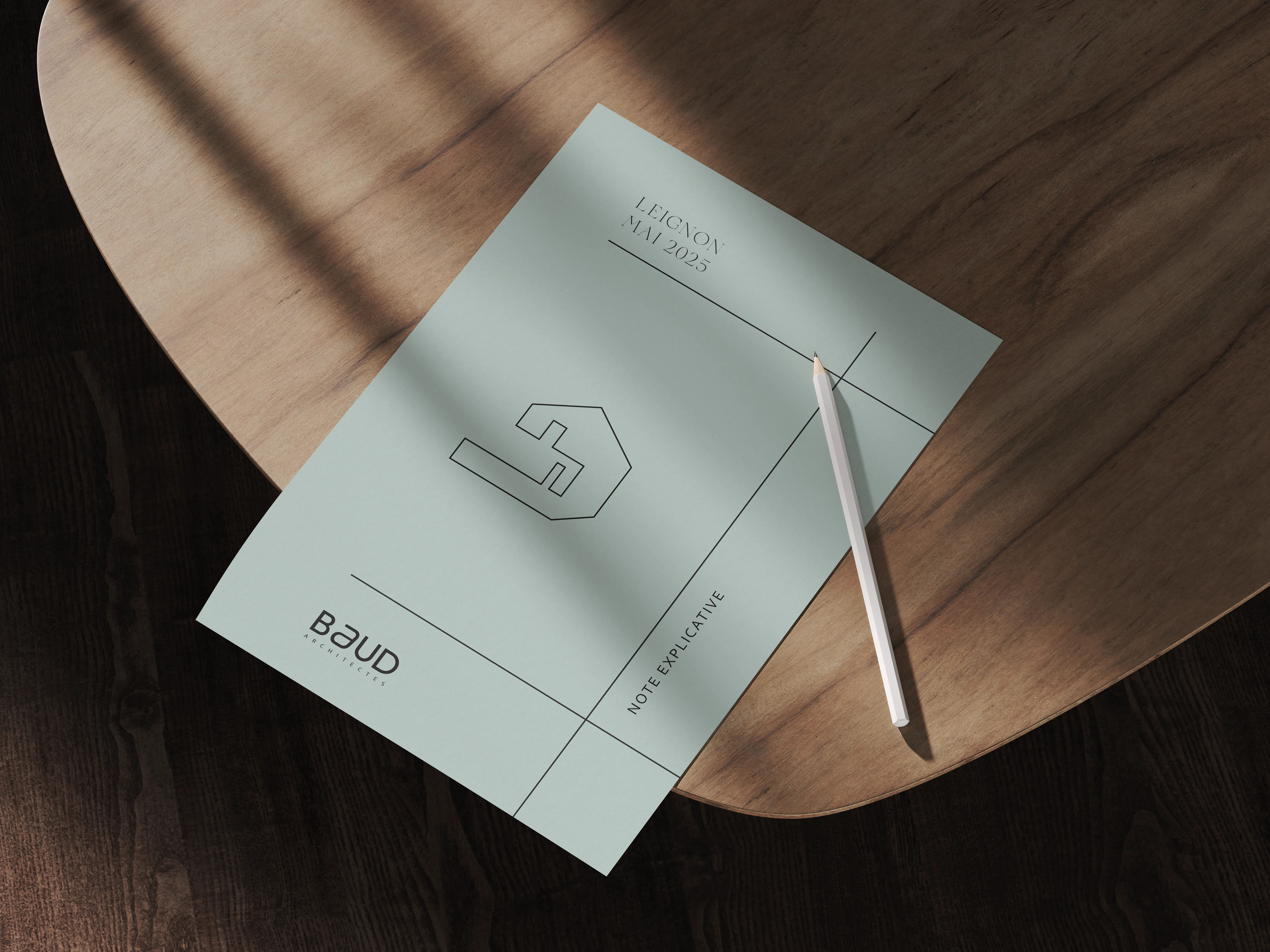
The challenge was to design an identity system capable of evolving with each project while maintaining a strong and recognizable brand signature.

Baud Architects — Visual

Concept

The identity is built around the idea that every architectural project has its own distinctive silhouette.

Instead of creating a single static logo, the branding introduces a system where each project receives a unique graphic profile derived from the geometry of the building.

These simplified line drawings translate architectural volumes into abstract graphic elements. Each profile becomes a visual signature for the project while remaining part of the same visual language.

This approach allows the identity to evolve organically alongside the studio’s portfolio.

Baud Architects — Visual

The Logo

The BAUD logotype uses a contemporary geometric typeface that emphasizes clarity and balance.

Its clean curves and generous spacing convey precision and professionalism — values central to architectural practice.

At the heart of the identity lies a stylized “a”, extracted from the logotype itself. This symbol becomes the distinctive element of the brand.

Its continuous rounded form evokes architectural lines and structural fluidity while maintaining a strong visual simplicity.

Baud Architects — Visual
Baud Architectes — Visual

The Project Marker

The stylized “a” also functions as a project marker within the identity system.

When paired with a project name, it acts as a visual indicator — similar to the logic of a digital tag or “@”.

This creates a clear connection between the studio and its individual projects while maintaining a consistent brand language.

The symbol becomes both a signature and a navigational element within the studio’s communication.

Baud Architects — Visual

Graphic Profiles

Each architectural project is represented by a unique graphic profile derived from its characteristic forms.

These line-based icons abstract key structural elements of the buildings — façades, angles, volumes, or silhouettes.

Together they create a visual library of architectural identities linked to the studio’s work.

Baud Architects — Visual

Applications

The identity is designed to function across architectural contexts — from construction sites to presentation documents.

Large-scale applications such as construction banners reinforce visibility on site, while printed materials maintain a refined and professional aesthetic.

The minimal graphic language ensures clarity across both technical and visual communication.

Baud Architects — Construction banner
Baud Architects — Logo mockup
Baud Architects — Visual

Result

The result is a modular visual identity that mirrors the nature of architectural practice: structured, adaptable, and evolving with each project.

Rather than a static logo, the system becomes a living archive of the studio’s architecture.

Baud Architects — Visual
Baud Architects — Construction cap
Baud Architects — Flyer mockup
Baud Architects — Banner mockup
Baud Architects — Construction fence

HEX #1F1F21

RGB 31, 31, 33

CMYK 6, 6, 0, 87

HEX #F4F4F2

RGB 244, 244, 242

CMYK 0, 0, 1, 4

HEX #C6DCDA

RGB 198, 220, 218

CMYK 10, 0, 1, 14

HEX #0C4651

RGB 12, 70, 81

CMYK 85, 14, 0, 68

HEX #CAF567

RGB 202, 245, 103

CMYK 18, 0, 58, 4

Color palette

The color palette reflects the balance between architectural rigor and contemporary sensibility.

A deep charcoal forms the foundation of the identity, conveying precision, stability, and professionalism. It is paired with an off-white tone that softens the composition and introduces a sense of clarity and space — much like the neutral materials often found in architectural environments.

Cool teal and muted aqua tones introduce a subtle reference to construction materials, technical drawings, and urban landscapes. These colors bring depth to the identity while maintaining a restrained and professional aesthetic.

A vibrant lime accent is used sparingly to introduce contrast and highlight key elements, adding a modern and dynamic touch to the otherwise minimal palette.

Typography

The typographic system combines elegance with functional clarity.

Floreal, used for titles and headings, introduces a refined editorial tone. Its distinctive serif shapes bring sophistication and character to the identity, reinforcing the studio’s positioning within a design-driven architectural context.

For body text, Corbel provides balance through a clean and highly legible sans-serif structure. Its neutral geometry ensures clarity across documents, presentations, and technical communication.

Together, the combination of Floreal and Corbel creates a dialogue between expression and precision — reflecting the balance between creativity and structure inherent to architectural practice.

Concept proposal for the visual identity of Baud Architectes.

Work with me