Can Pruna
Hospitality & tourism, Catalonia, Spain
2025
Visual identity
Overview
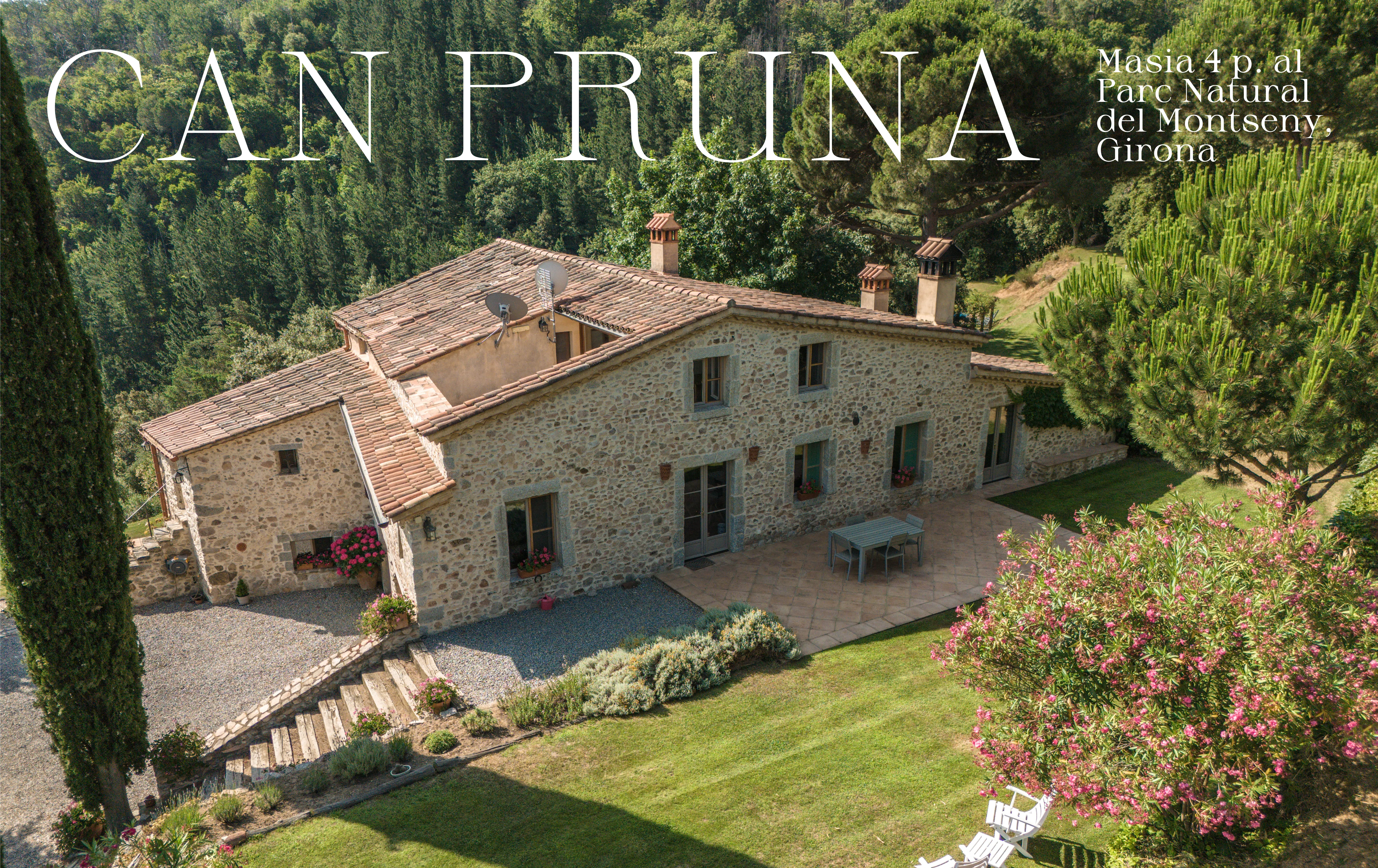
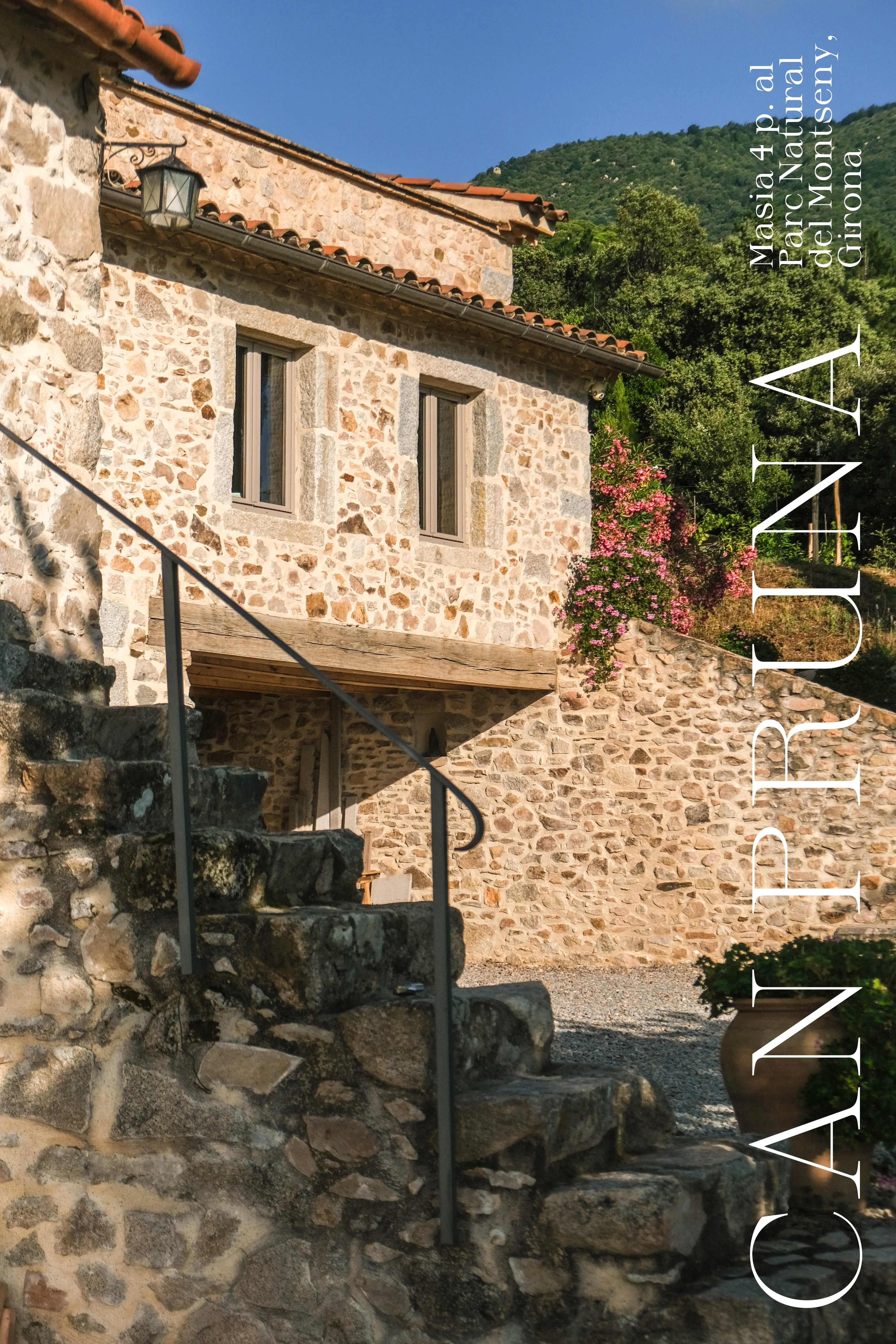
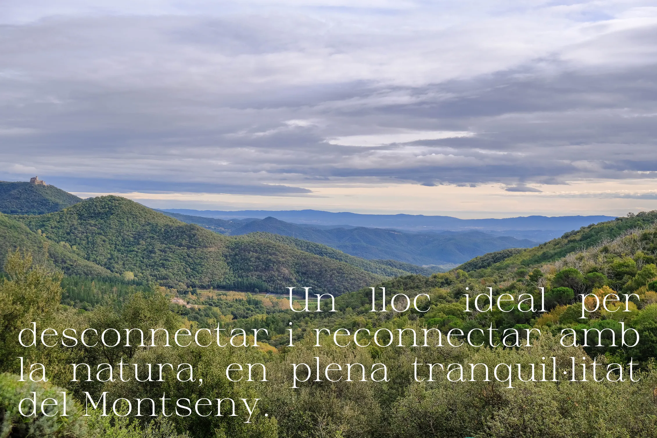
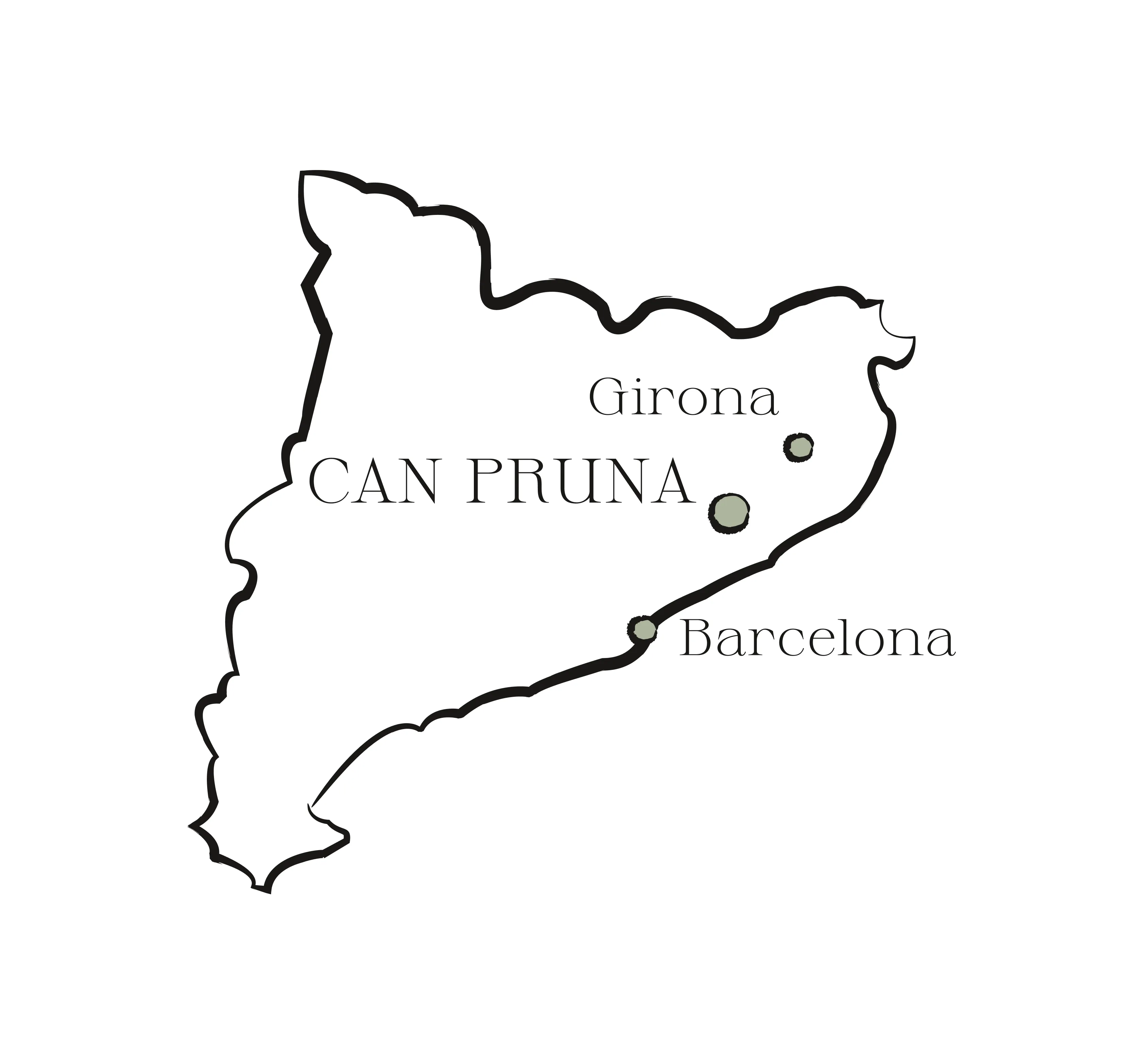
Can Pruna is a rural accommodation in Catalonia, surrounded by dry stone, olive tones, and the quiet rhythm of the Montseny landscape.
Solutions
- Visual identity
- Web design
- Photography
- Art direction
Project
Can Pruna is a rural accommodation in Catalonia, surrounded by dry stone, olive tones, and the quiet rhythm of the Montseny landscape.
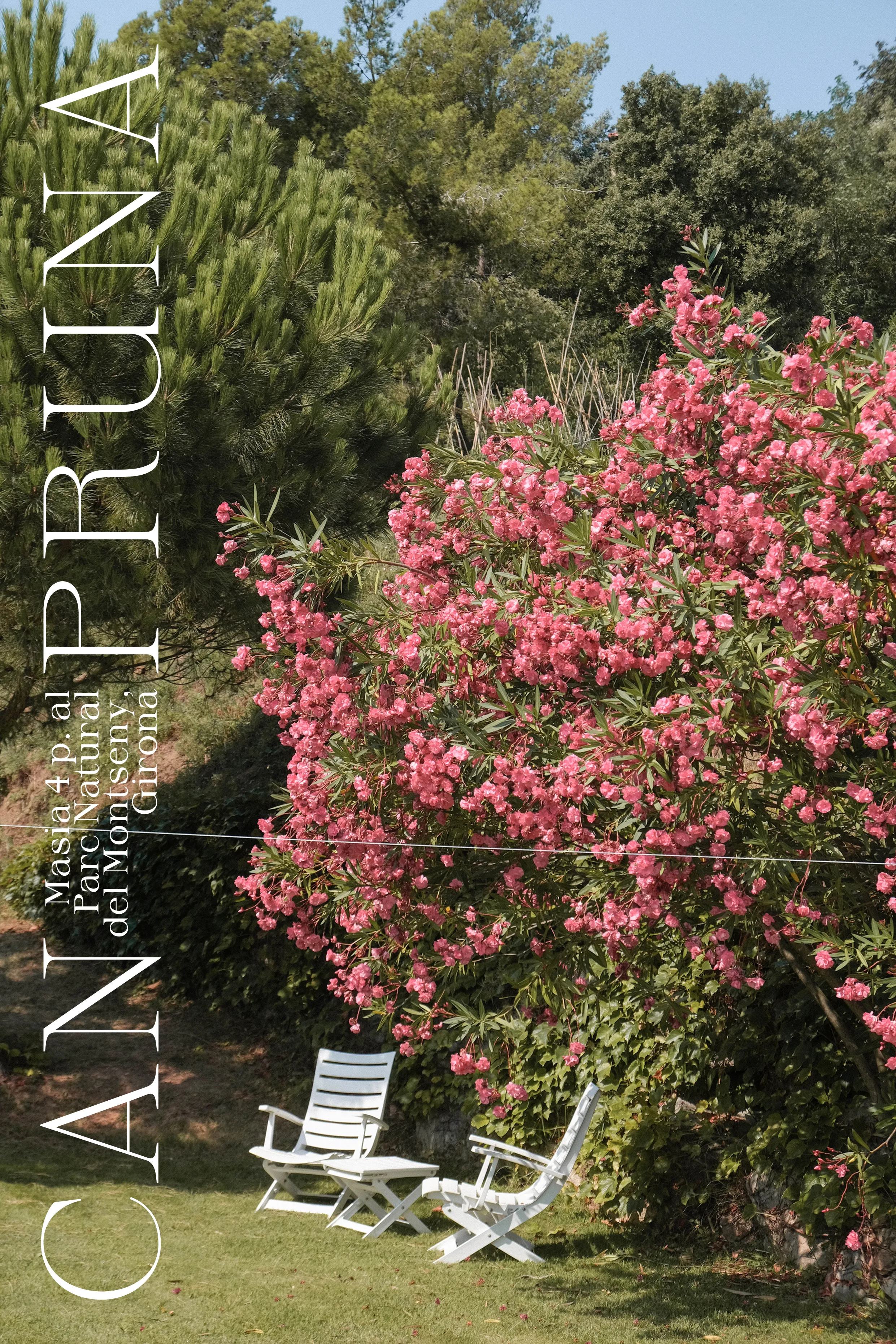
The identity distills that atmosphere into a calm visual story anchored by earth, olive, stone, and warm white tones drawn from the site.
Hand-sketched elements bring an artisanal touch, while generous spacing gives the photography and line art room to breathe.
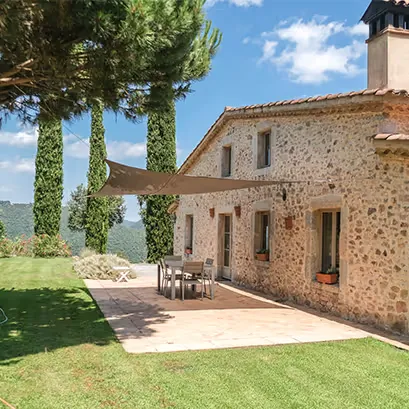
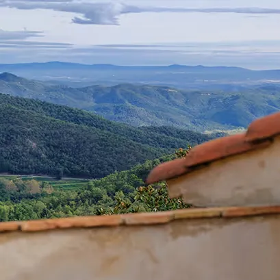
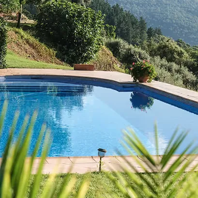
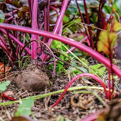
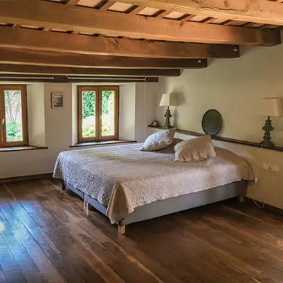
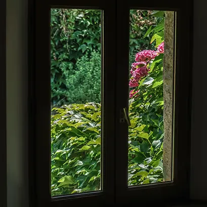
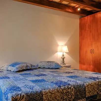
I also photographed and retouched the site imagery so the visual world feels quiet, hospitable, and directly connected to the Masia.
Branding
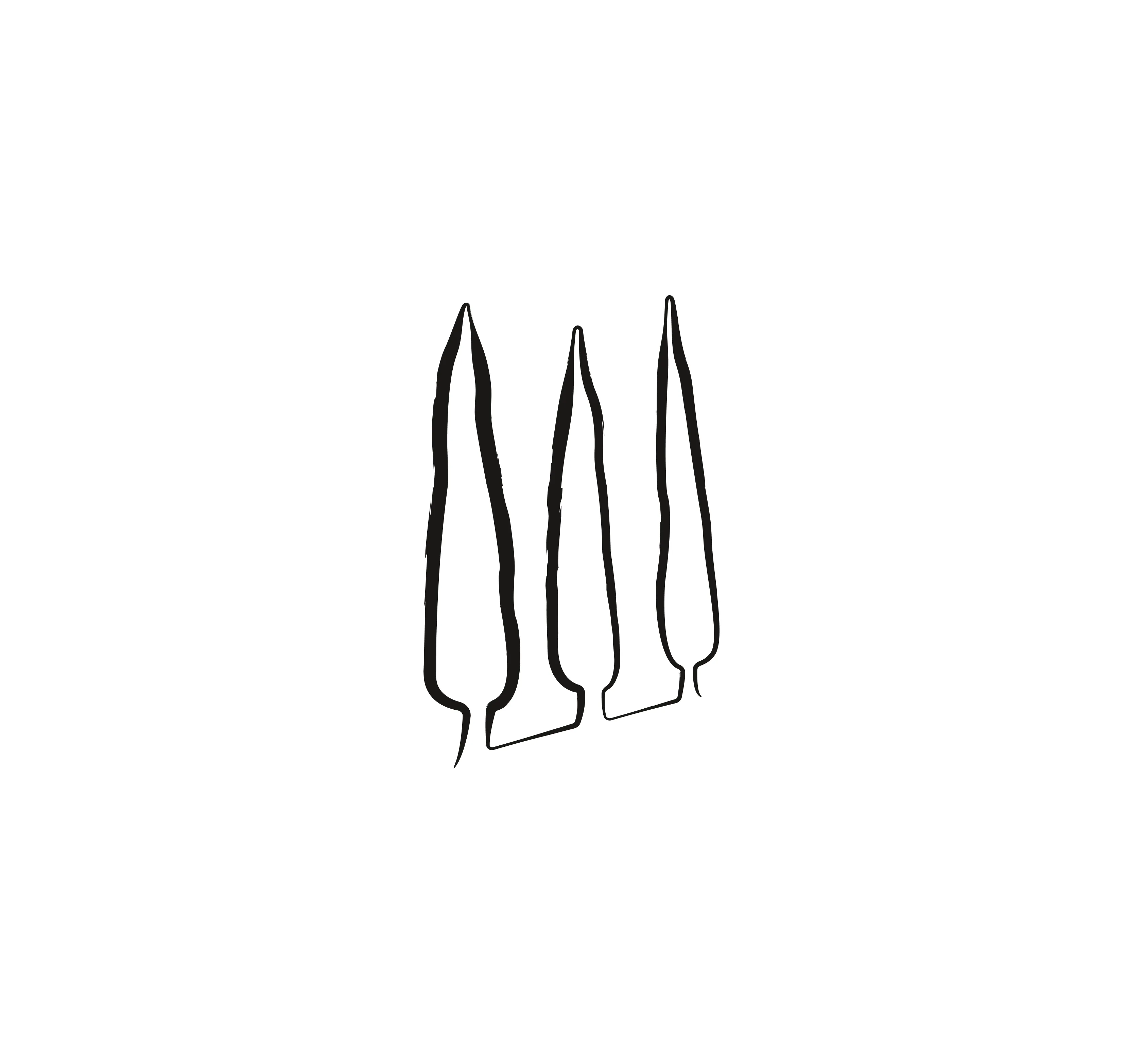
The logo features three stylized cypress trees set in subtle perspective.
In Mediterranean lore, one cypress offers a drink, two promise food and drink, and three signal full accommodation: drink, a meal, and a bed for the night.
That symbolism became the heart of the brand: a gracious welcome under the Montseny sky.
Palette
[01] #1B1816
RGB 27, 24, 22
CMYK 0, 11, 19, 89
[02] #272C1F
RGB 39, 44, 31
CMYK 11, 0, 30, 83
[03] #ADB49E
RGB 173, 180, 158
CMYK 4, 0, 12, 29
[04] #EBE3DB
RGB 235, 227, 219
CMYK 0, 3, 7, 8
[05] #F6F3EE
RGB 246, 243, 238
CMYK 0, 1, 3, 4
[06] #FFFFFF
RGB 255, 255, 255
CMYK 0, 0, 0, 0
The color system balances deep natural anchors with soft mineral neutrals.
Charcoal and forest green bring structure and depth, olive adds a vegetal note, and the two pale tones keep the identity breathable and luminous.
Applications
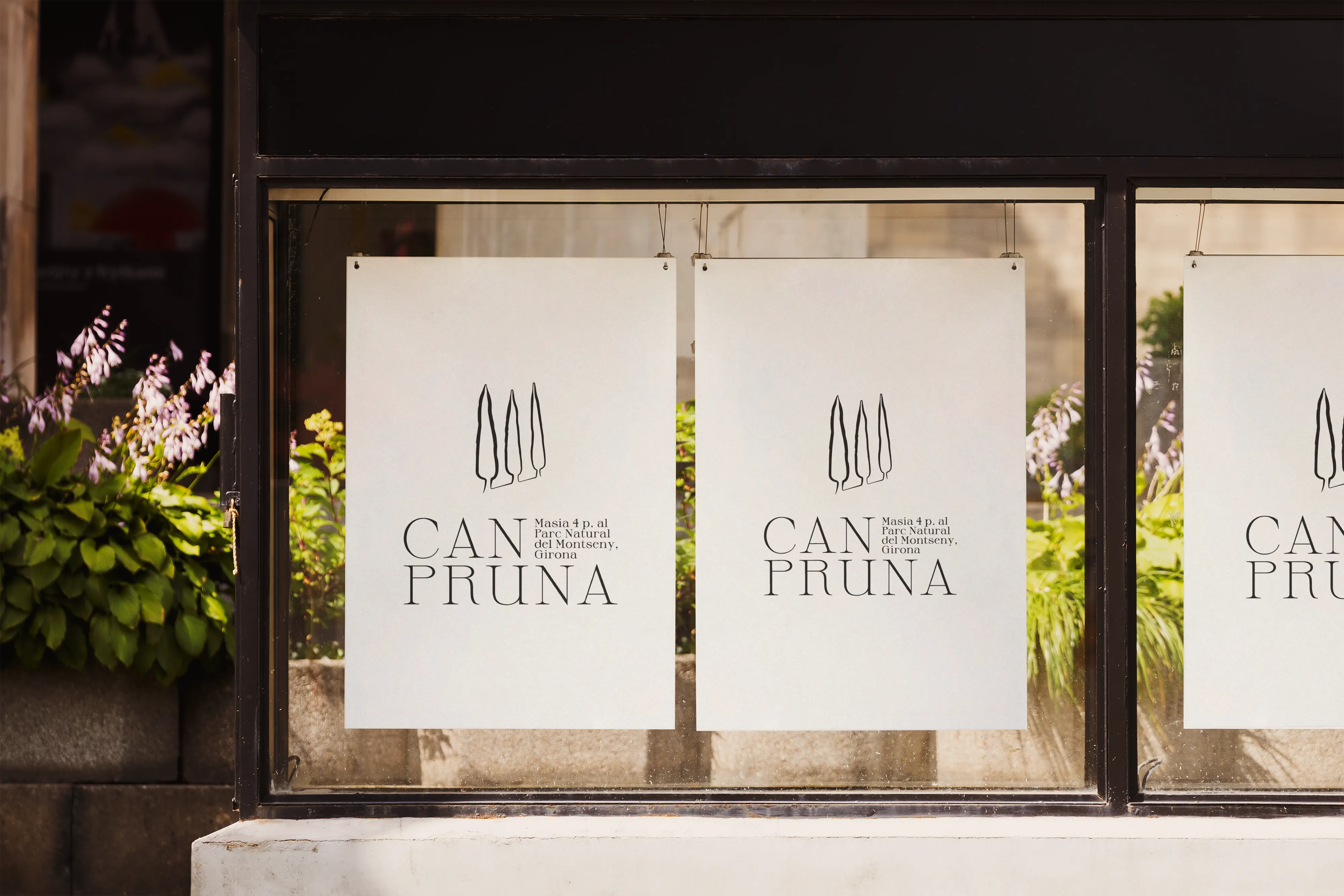
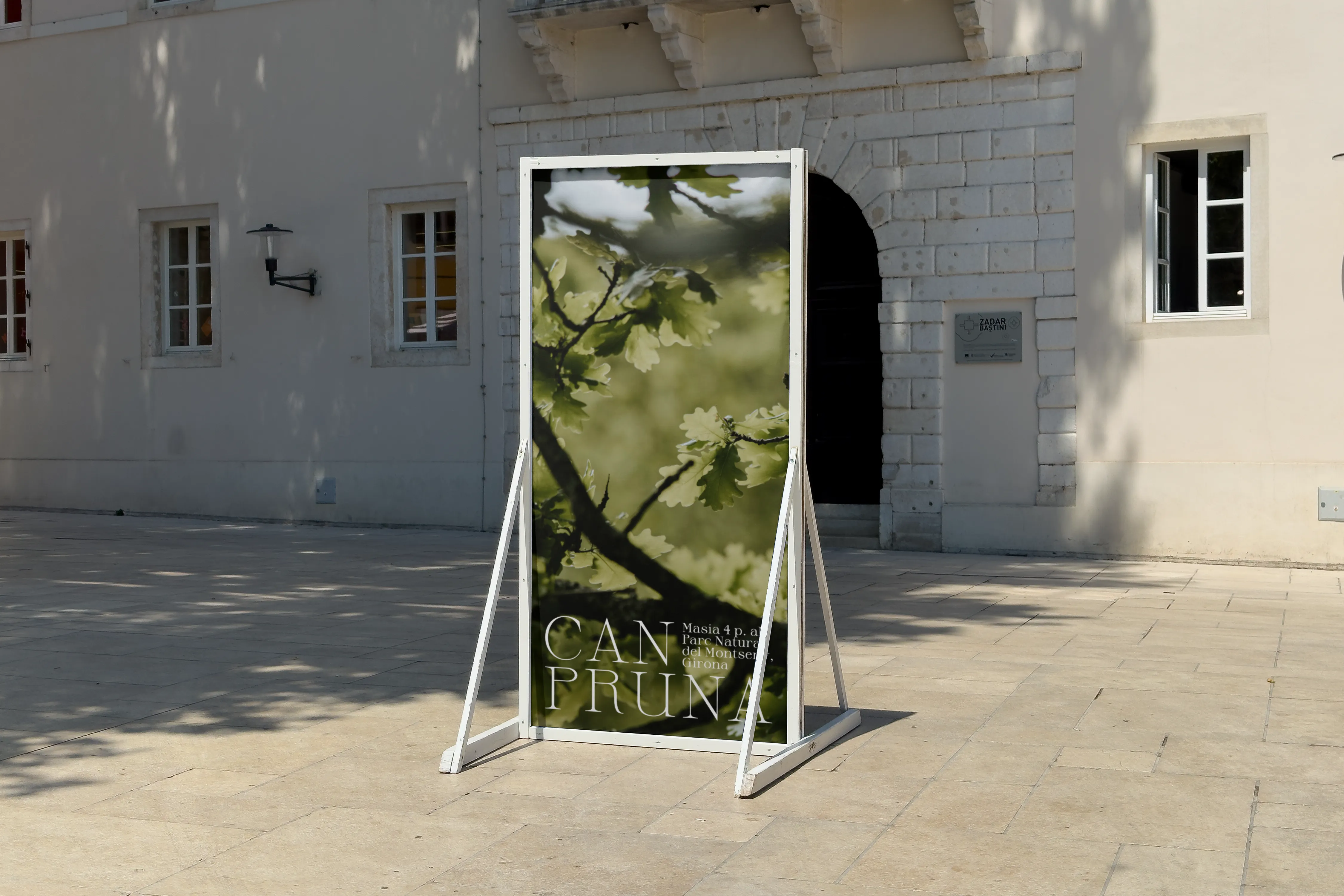
The system was designed to move easily between print, signage, digital touchpoints, and the slower rhythm of the place itself.
Mockups keep the identity tangible: from arrival signage and posters to business cards and guest-facing visual material.
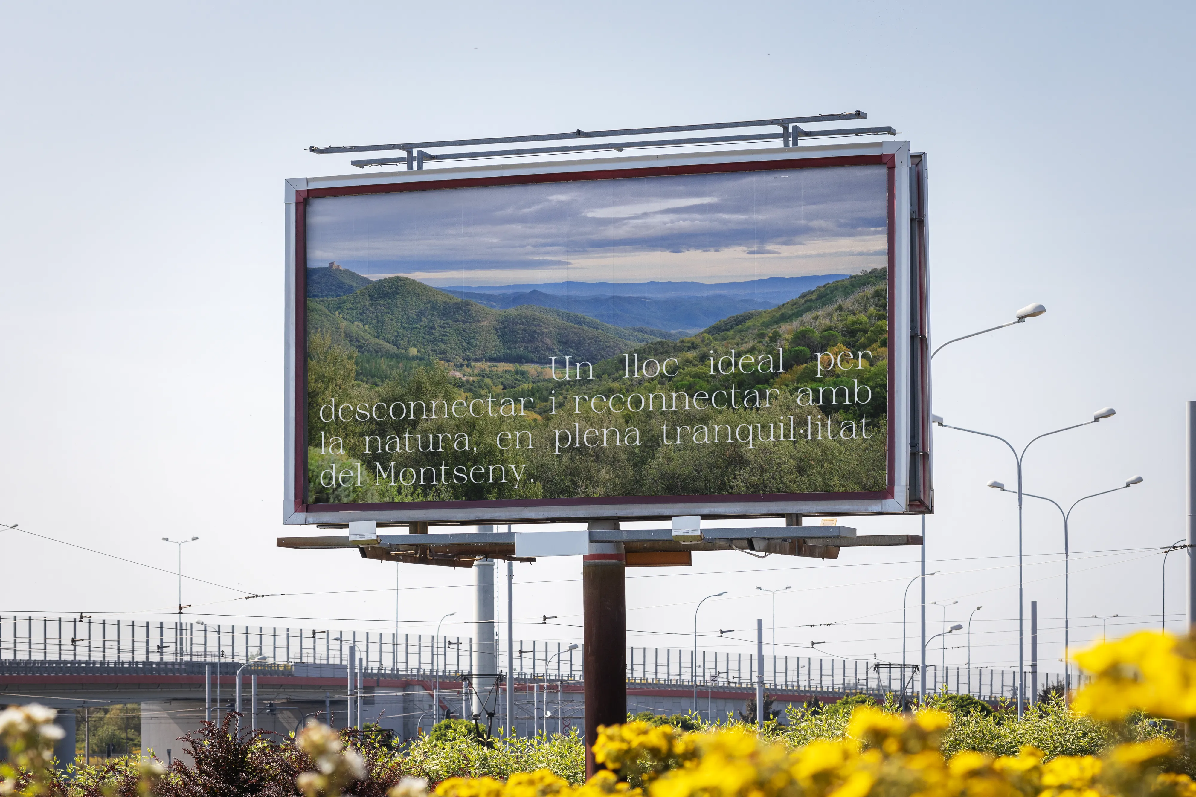
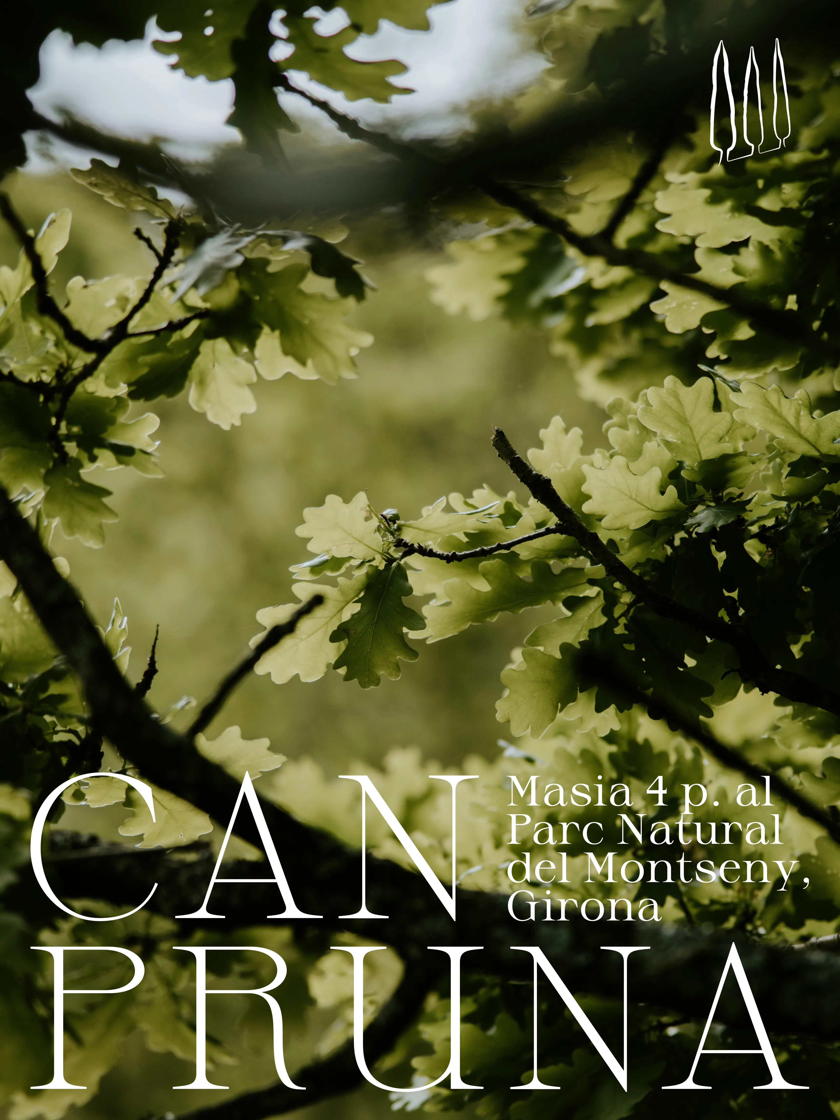
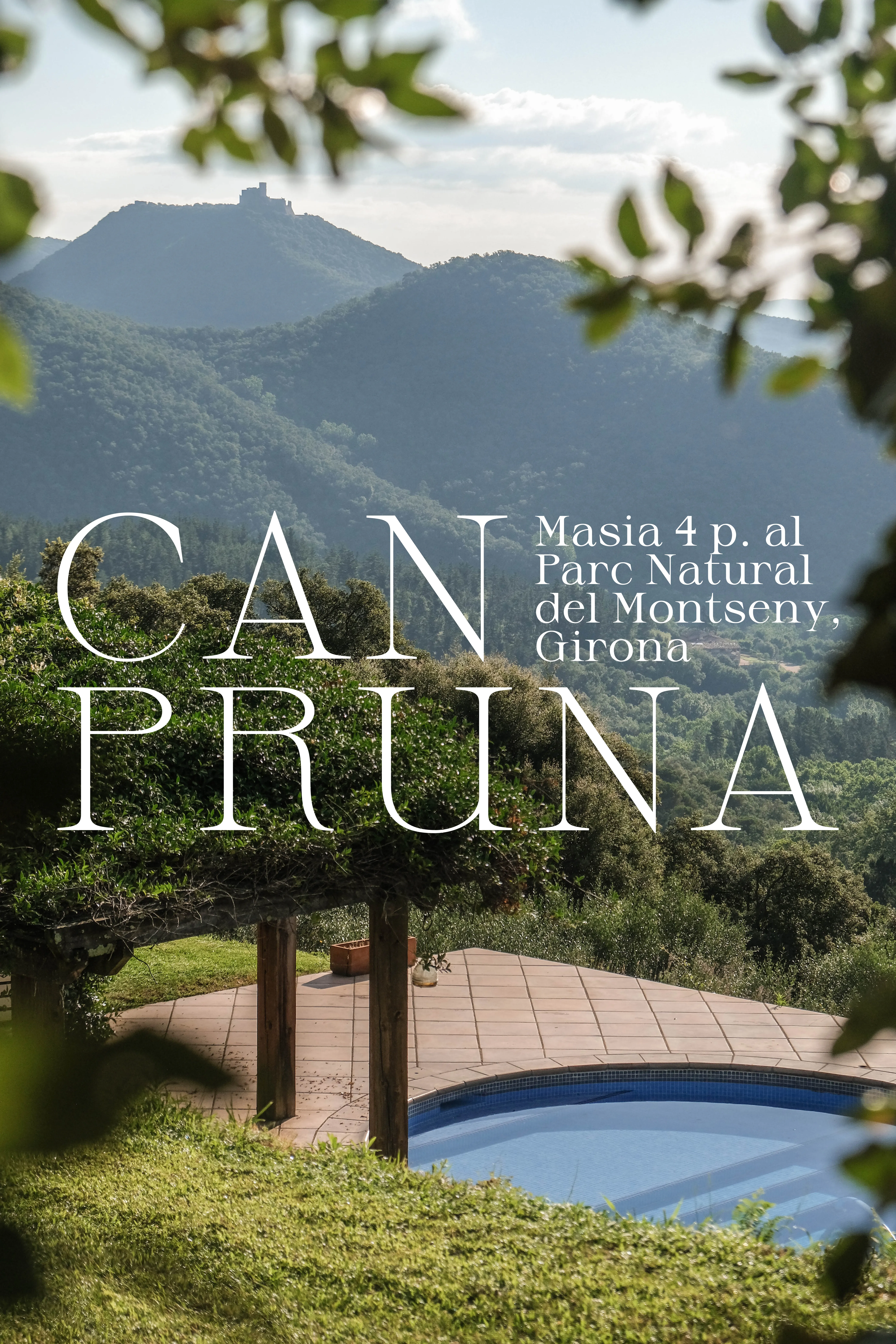
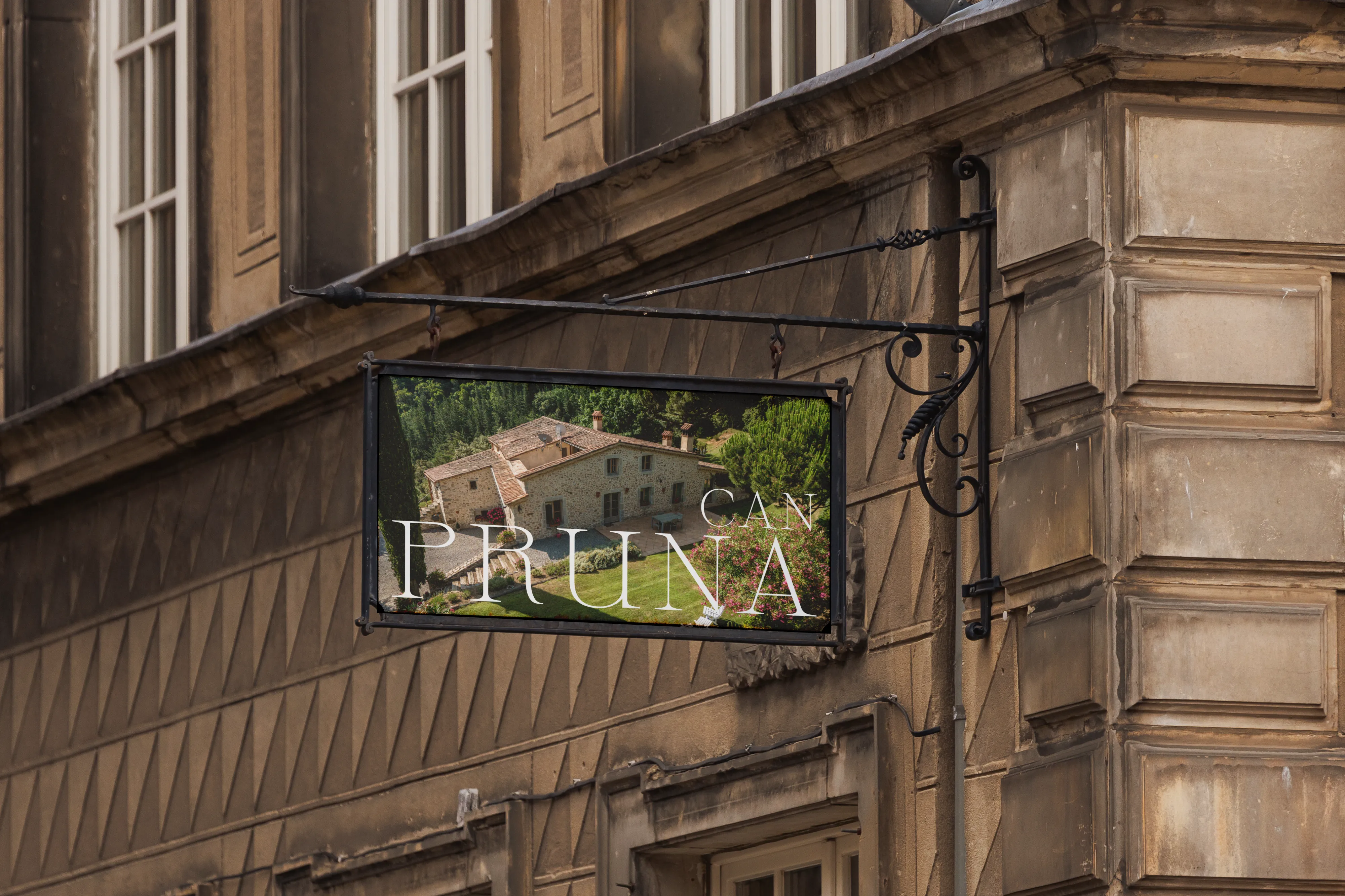
A grounded identity system for hospitality, built to feel welcoming before the guest even arrives.
More projects