Alyssa Coleman — Back of House
Coaching for creatives, Canada
2026
Showit website
Overview
Alyssa Coleman came to me with an existing Showit site that had grown organically over the years — and it showed. Pages felt disconnected, the visual hierarchy unclear, the layout lacking the intentional structure a personal brand at her level deserved. Meanwhile, Alyssa was pivoting entirely: new positioning, new audience, new energy — slow marketing and soft systems for creative entrepreneurs. The brand direction and visual identity were handled by Lara González. My job was to take that new brand and build a site that finally matched where she was going — from scratch, pushing Showit well beyond its defaults.
Solutions
- Content architecture
- Page hierarchy & navigation
- Custom functionality & interactions
- Collaboration with brand designer Lara González
- Launch
Stack
- Showit
The challenge
Alyssa Coleman came to me with an existing Showit site that had grown organically over the years — and it showed. Pages felt disconnected, the visual hierarchy unclear, the layout lacking the intentional structure a personal brand at her level deserved. Meanwhile, Alyssa was pivoting entirely: new positioning, new audience, new energy — slow marketing and soft systems for creative entrepreneurs. The brand direction and visual identity were handled by Lara González. My job was to take that new brand and build a site that finally matched where she was going — from scratch, pushing Showit well beyond its defaults.
What we built
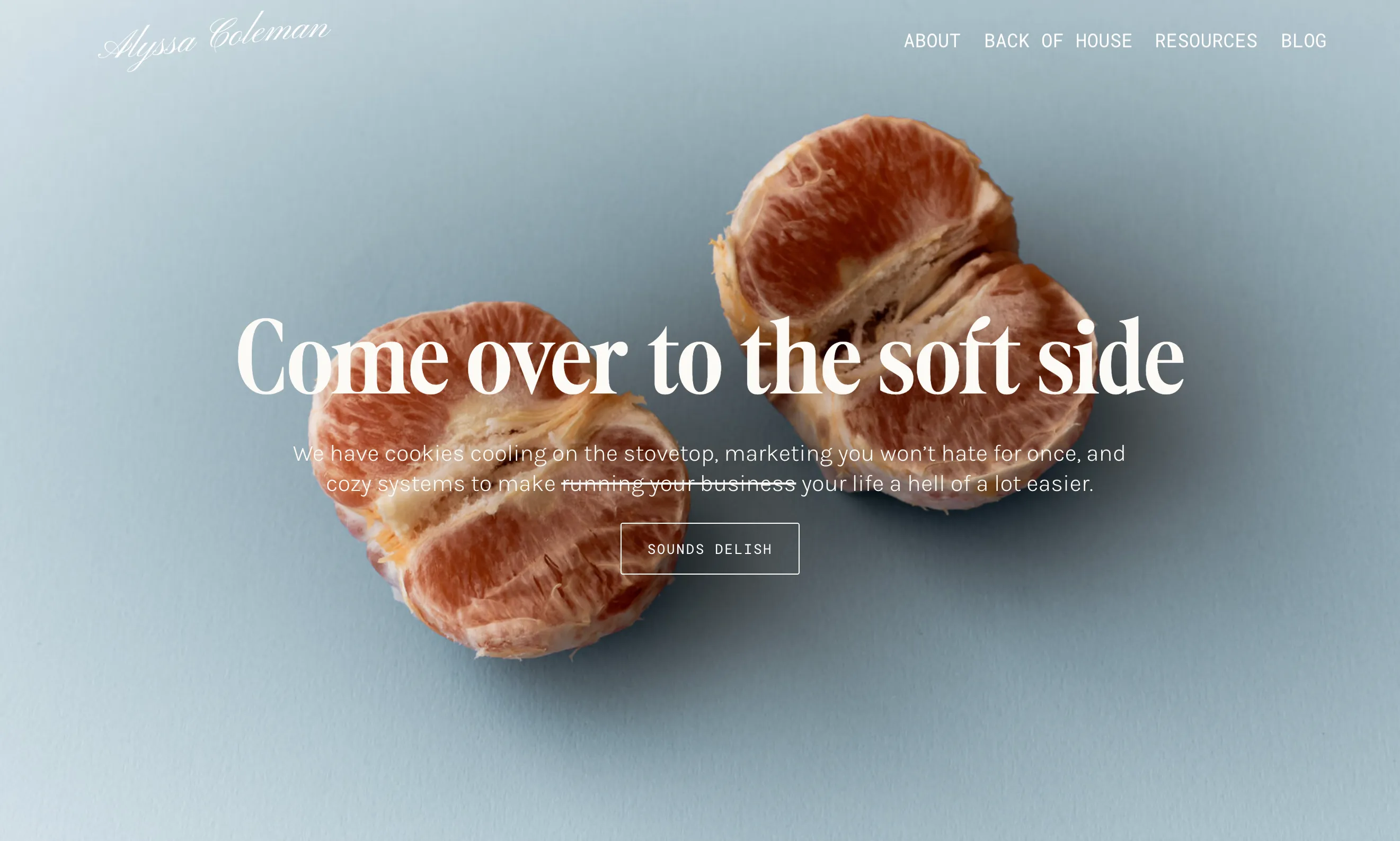
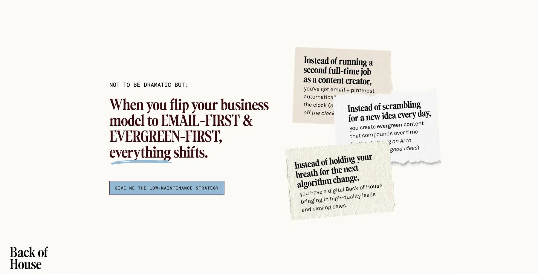
Translating a brand into a site — Lara's branding set the tone: cozy, intentional, soft. My role was to make the site feel exactly that way: every layout decision, spacing choice, and interaction designed to match the energy of the new positioning, not just apply the colors.
A new content architecture — the pivot came with a new core offer: Back of House. I redesigned the entire site structure around it: new page hierarchy, new navigation logic, new user journey from first visit to conversion.
Showit, pushed further — Showit has limits. I worked around them: customizing functionality, building interactions, and personalizing features well beyond what the platform offers out of the box.
Palette
[01] #000000
RGB 0, 0, 0
CMYK 0, 0, 0, 100
[02] #380D0F
RGB 56, 13, 15
CMYK 0, 77, 73, 78
[03] #93B9D3
RGB 147, 185, 211
CMYK 30, 12, 0, 17
[04] #FCFAF5
RGB 252, 250, 245
CMYK 0, 1, 3, 1
[05] #E0DACE
RGB 224, 218, 206
CMYK 0, 3, 8, 12
[06] #59463A
RGB 89, 70, 58
CMYK 0, 21, 35, 65
Before
Scattered starting point
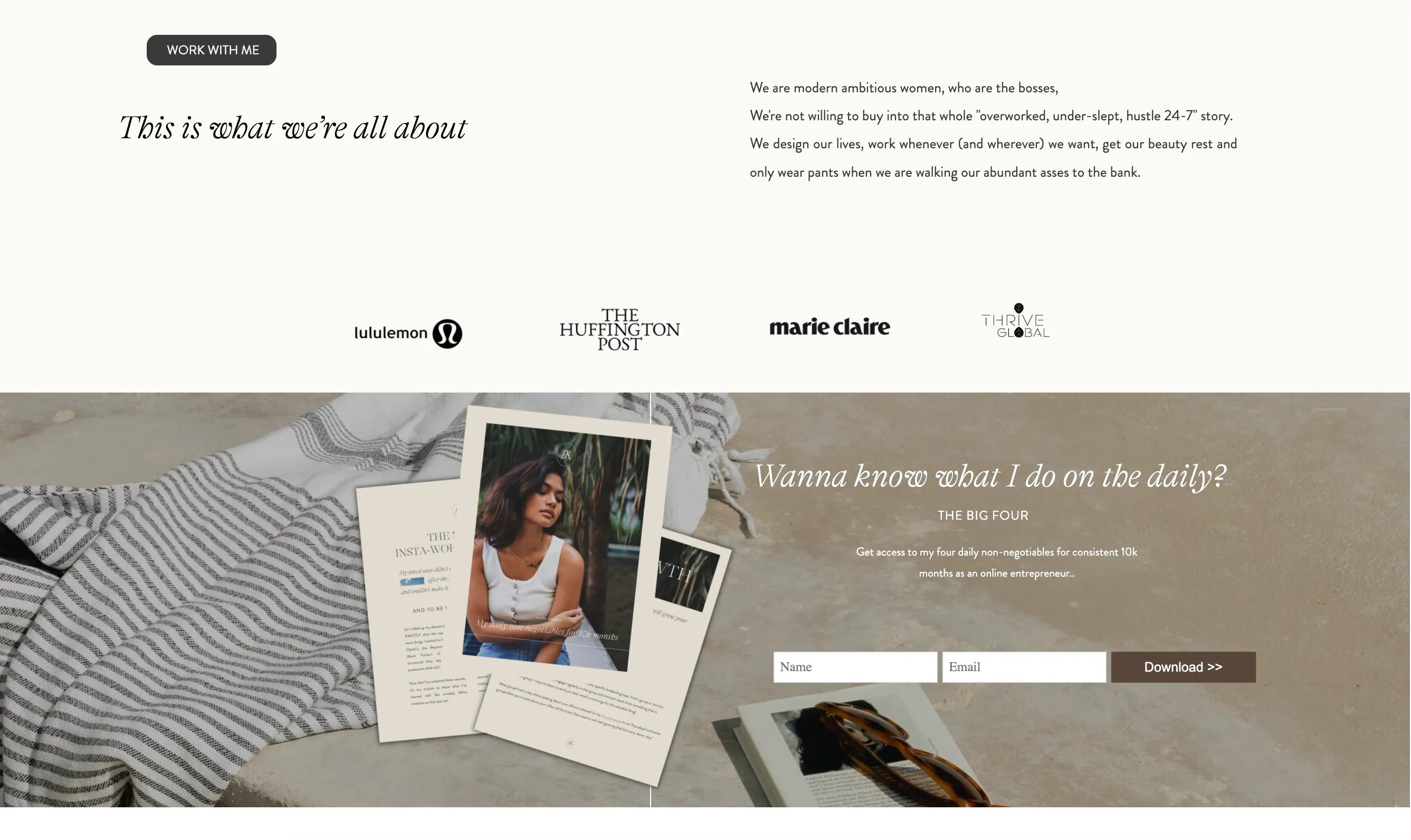
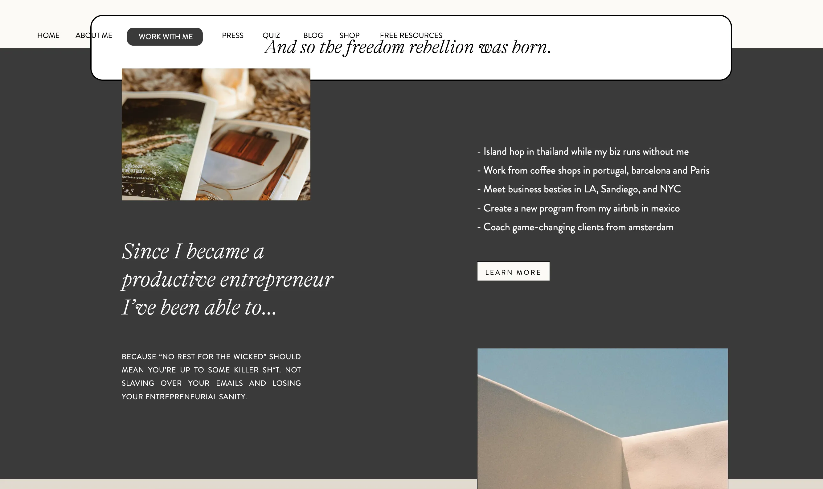
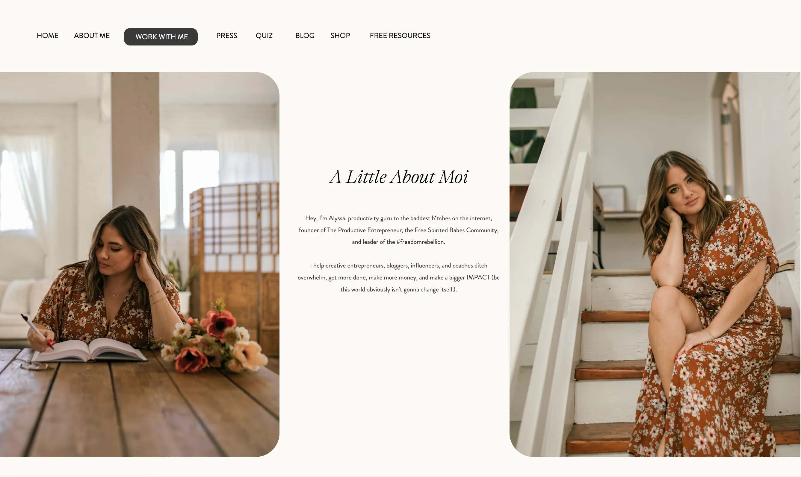
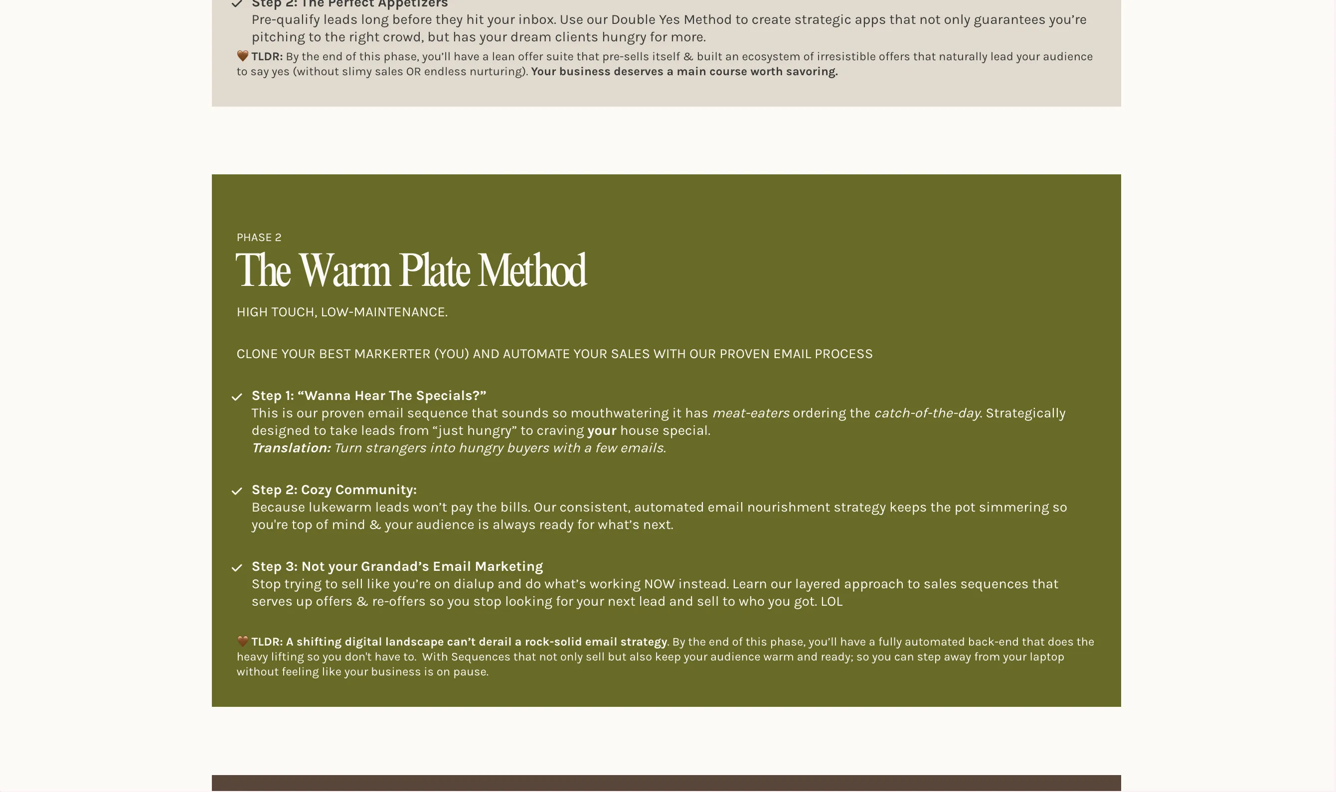
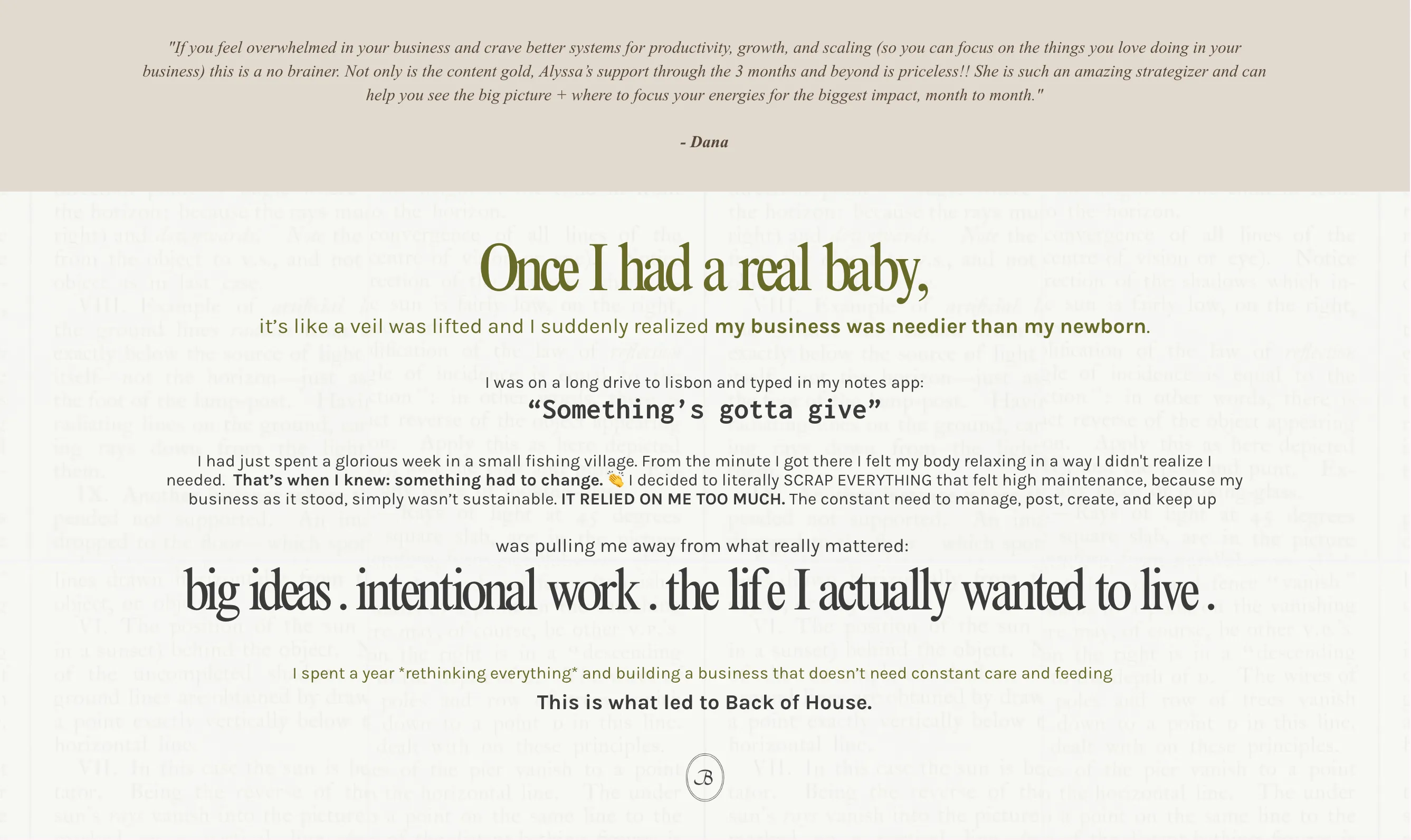
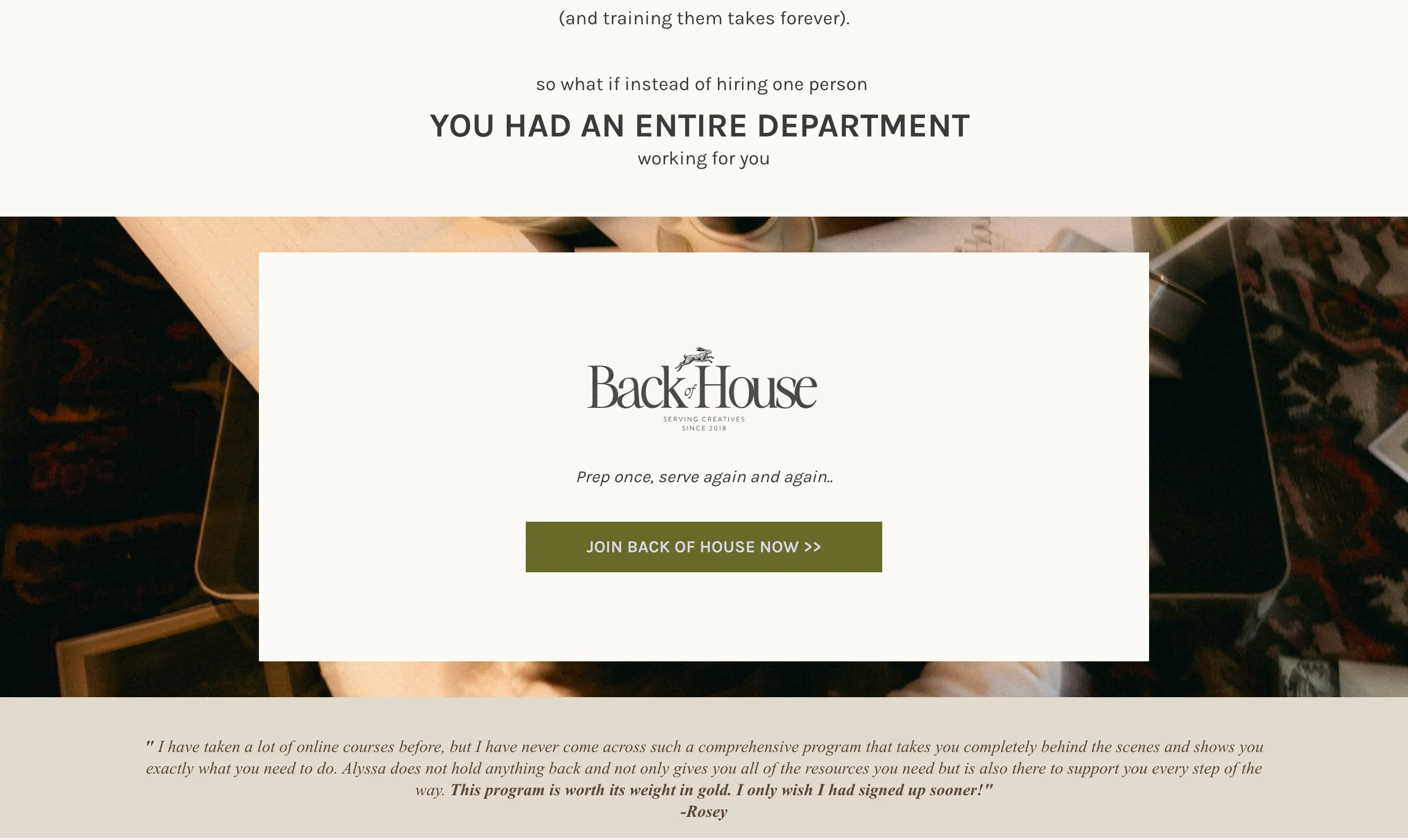
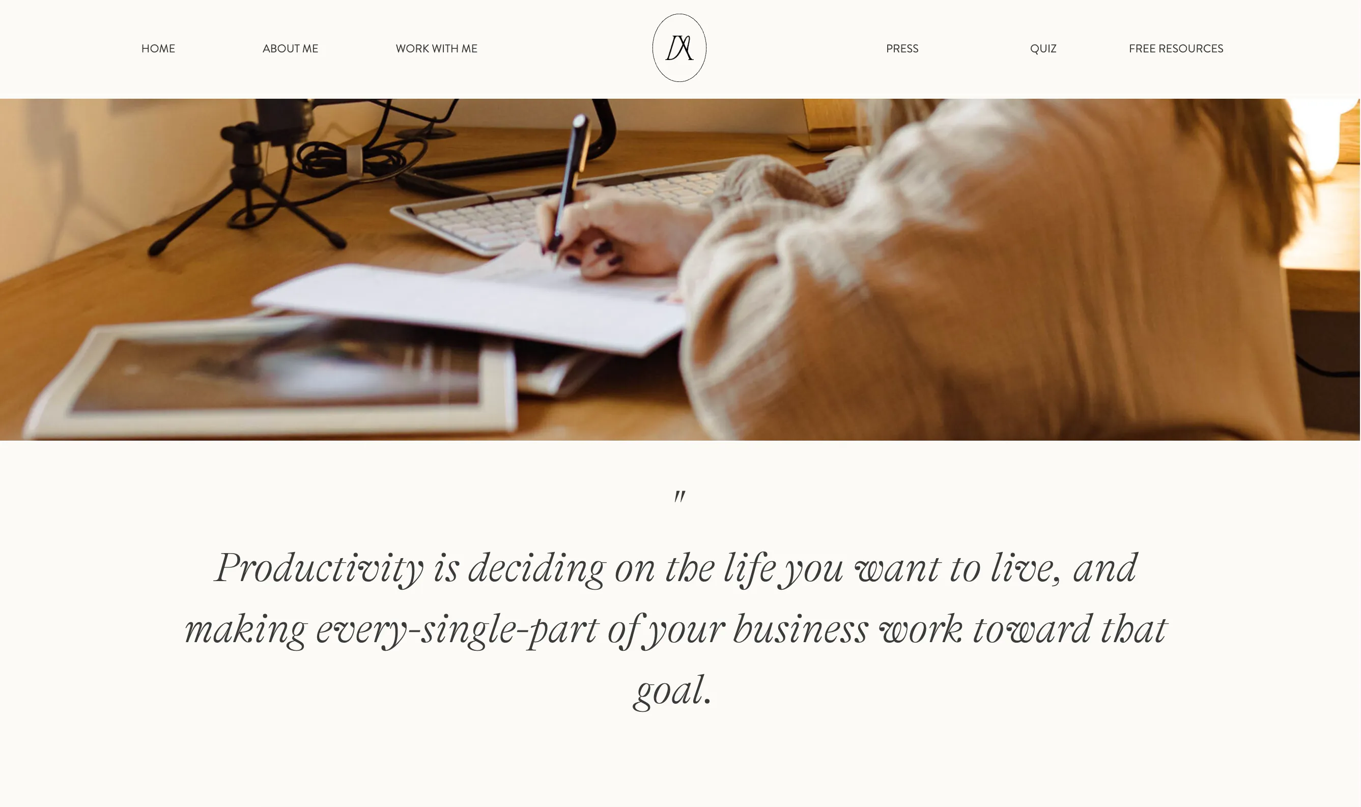
A small sample of the previous site mood: uneven pacing, unclear hierarchy, and a visual language that no longer matched Alyssa's direction.
After
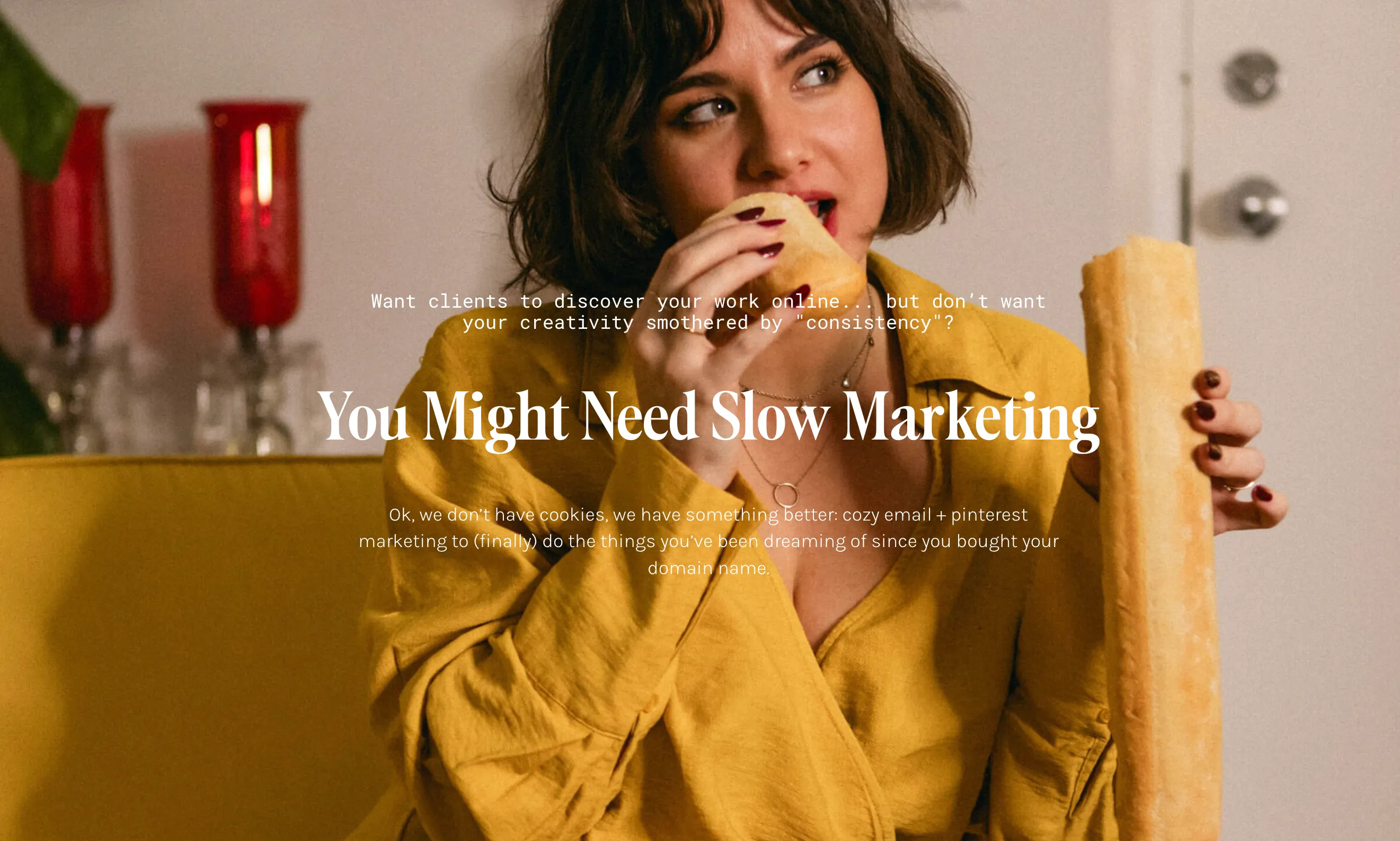
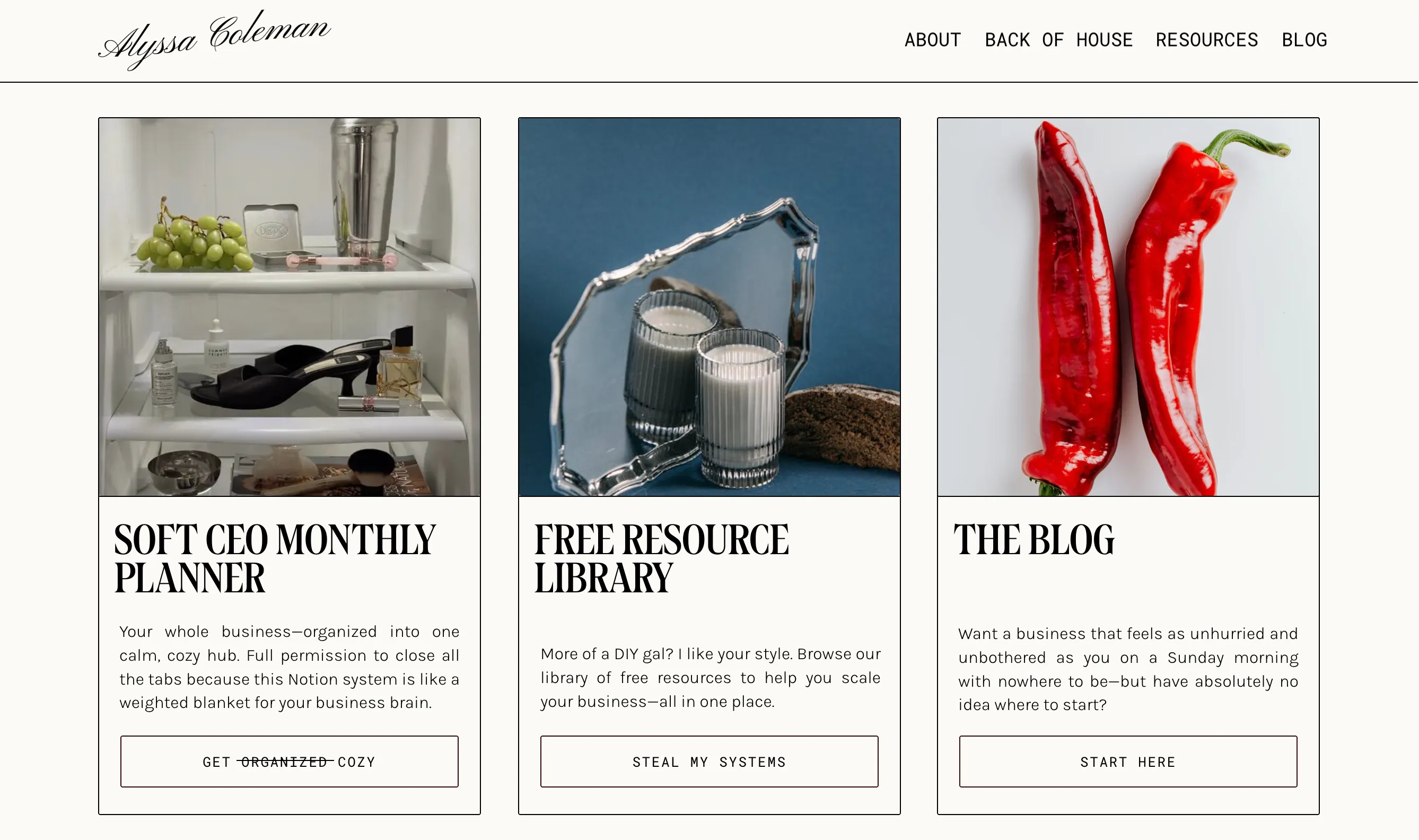
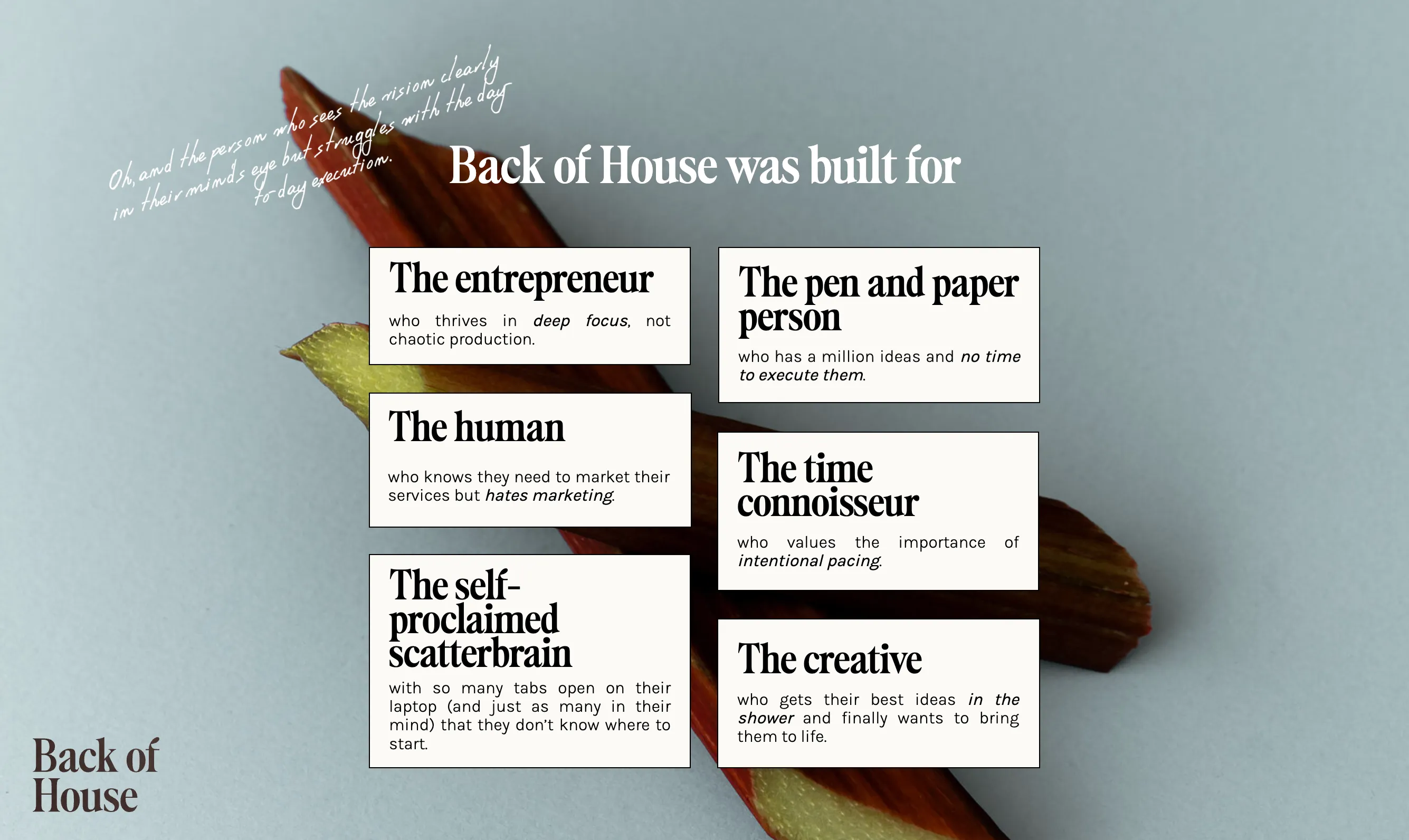
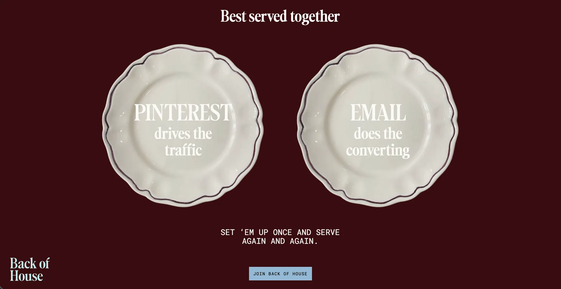
Softened visual system
A matching edit of final screens showing the new tone: warmer, clearer, softer, and built around the Back of House experience.


More projects